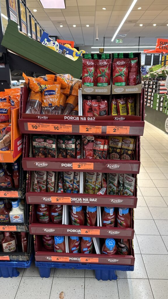
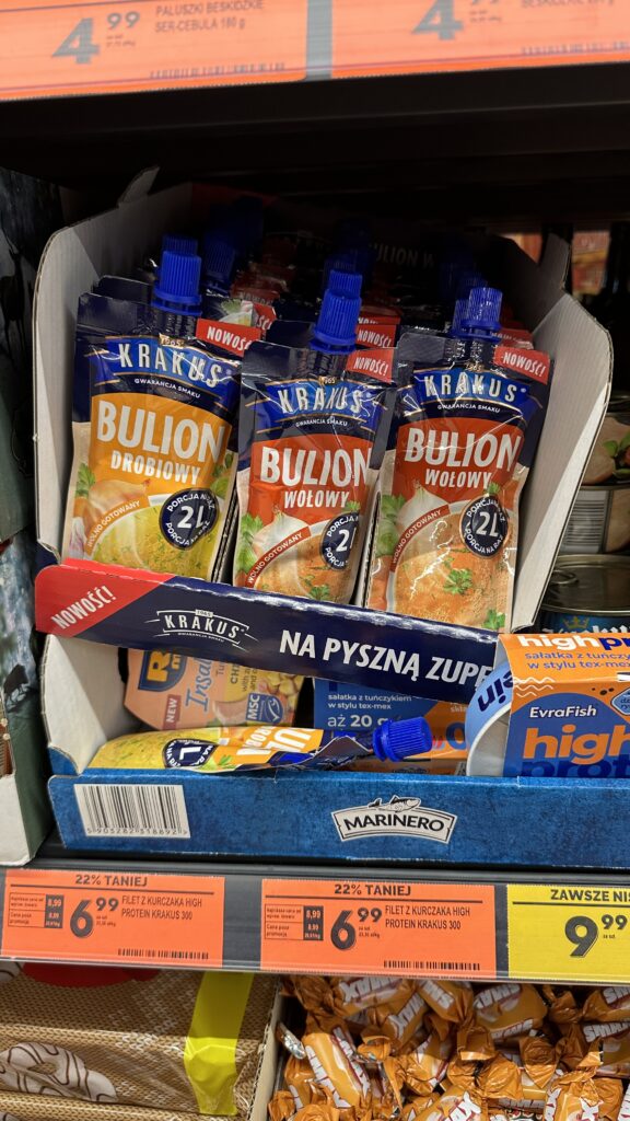
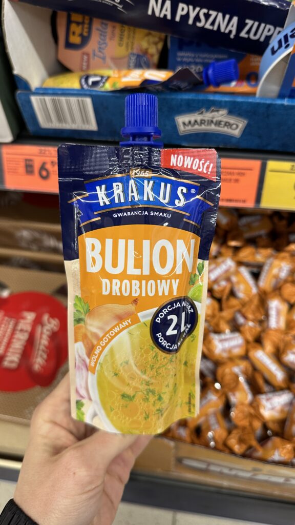
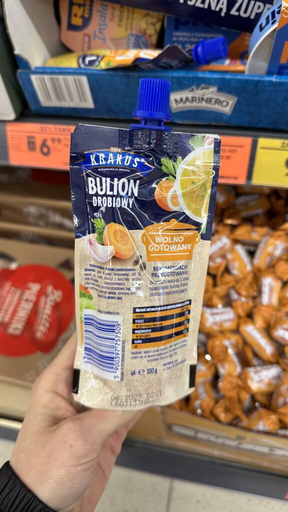
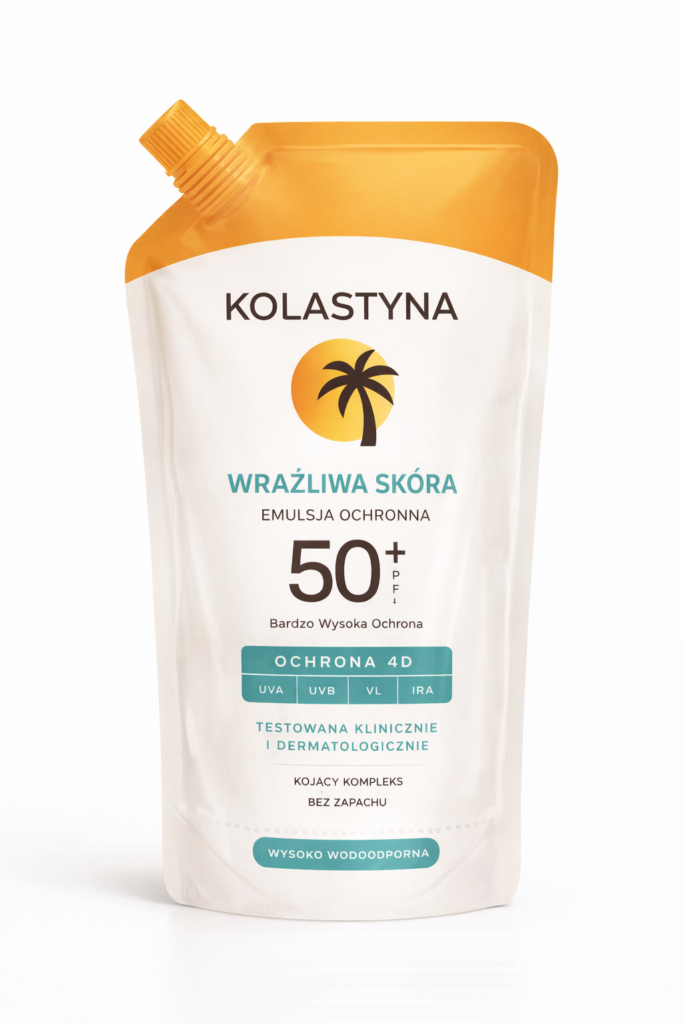
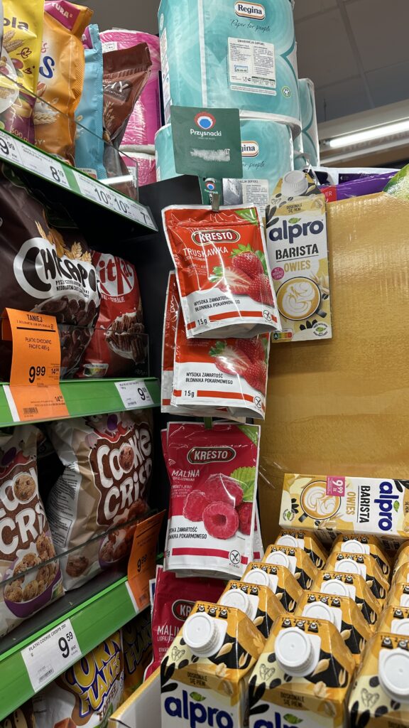
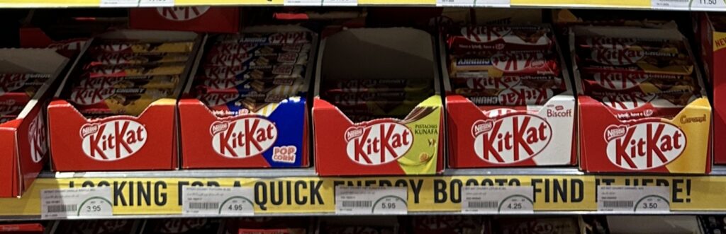
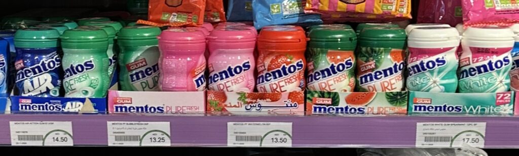
Visiting a store this week, I saw the first real sign of spring in FMCG: BBQ displays are back.
But something specific here caught my attention.
We are witnessing a shift from family-size formats to single-occasion packaging.
Think about a typical BBQ setup:
paper plates, cutlery
sauces
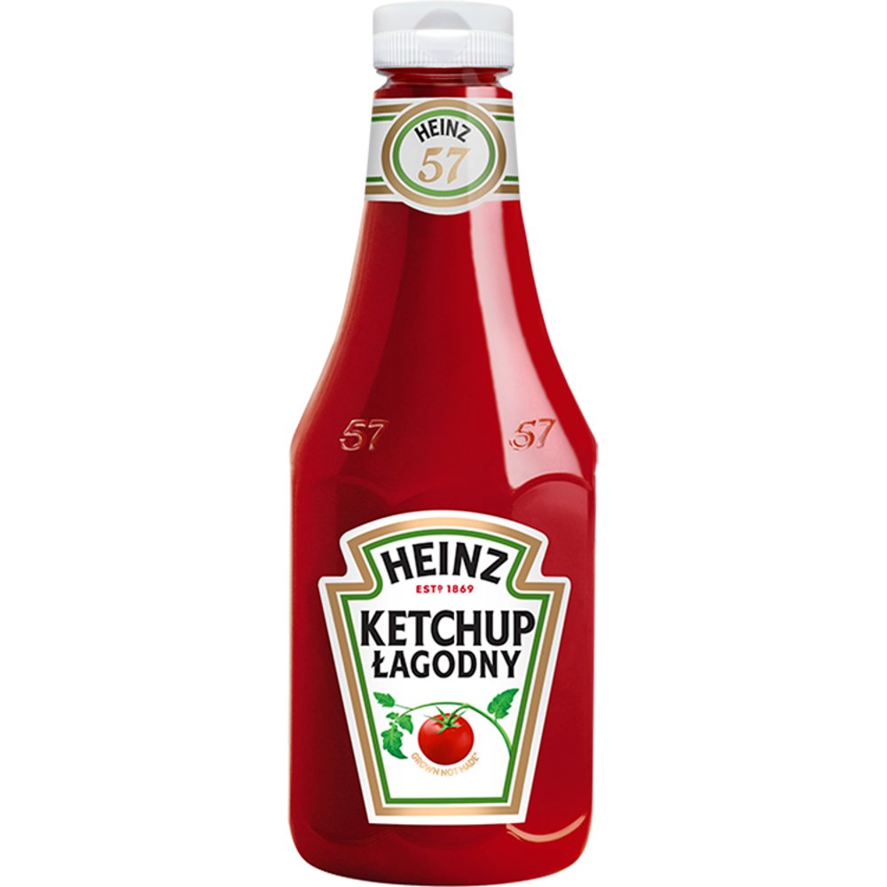
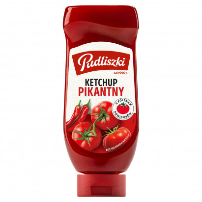
a large jar of mayonnaise, mustard and a bottle of ketchup, a BBQ, barbecue sauce, Thousand Island dressing…
Imagine the last point. All those jars and bottles.
It is heavy to carry it. It is expensive one-time-cost – inflating the bill of BBQ.
After party is over the question come- who takes the leftovers home? No one wants it, no one feels comofrtable to put it into trash.
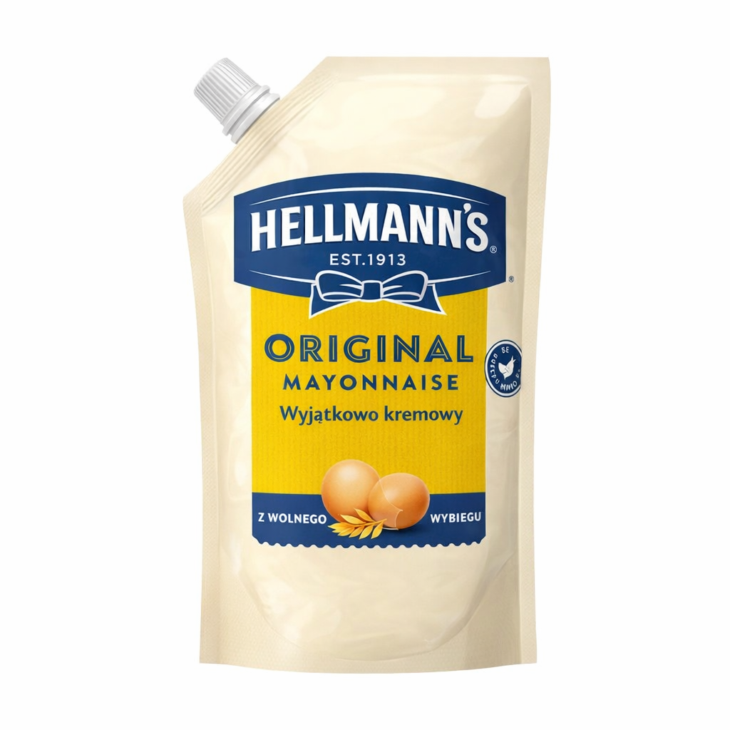
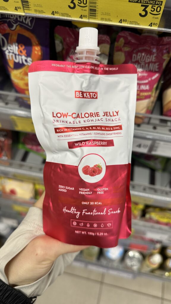
500g ketchup suddenly becomes a problem, not a solution. It’s inefficient, wasteful. This is where pouches come in.
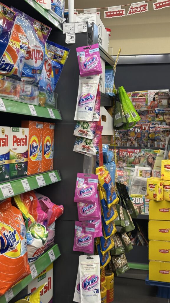
UX is quietly winning
Traditional rigid bottles are a design from another era.
We all know the moment: the ketchup is “finished”… but not really. You shake, you hit, you squeeze — and still leave 10–15% inside.
Pouches solve this perfectly:
full evacuation of product
intuitive usage (like toothpaste)
no frustration at the end
It’s not just packaging. It’s experience design.
And in FMCG — UX is becoming king again.
BBQ is just the beginning
Single-use or single-occasion pouches make perfect sense for:
ketchup, mayo, sauces
marinades
oils & dressings
They remove friction:
no leftovers
easy cost-sharing
less waste
light to carry
spoon not needed
This is not just convenience. This is context-based packaging — designed for the moment of use.
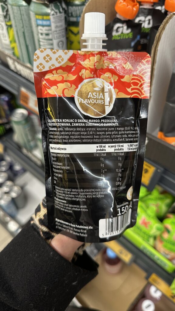
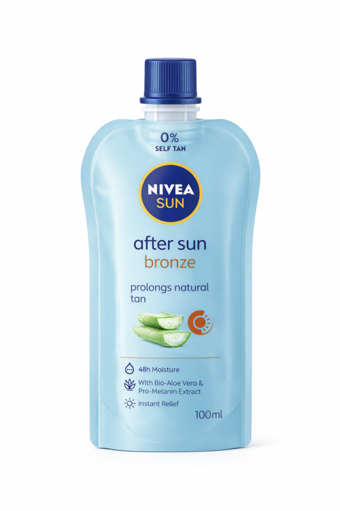
Asia already figured it out
Travel a bit, and you’ll see how far this can go.
In many Asian markets, pouches are not a niche — they are a default format, especially in cosmetics.
Seven Eleven Store
And this is where it gets really interesting.
My personal favorite example: SPF cream in a pouch.
Why it works:
zero leakage risk
lightweight
flexible — fits anywhere
perfect for daily carry
It removes the biggest barrier to usage: inconvenience.
With such product something annoying (carrying heavy bottle of SPF protection) becomes less friction act (small product that I can always have with myself and protect skin).
While the world is currently obsessed with the soft pinks of Japan’s cherry blossoms, the FMCG aisles are blushing a very different color: Matcha Green.
It feels as though we’ve blinked and the “Pistachio Fever” of last year has been seamlessly swapped for a “Matcha Obsession”. It is nearly impossible to navigate a store today without spotting a “green innovation” on every second shelf.
The formula for a 2026 hit seems deceptively simple:
take your bestseller,
add a dash of matcha,
wrap it in forest-green branding,
…and watch it fly. Voilà!
Let’s look at who is winning the green rush and where matcha actually makes sense but hasn’t arrived yet.
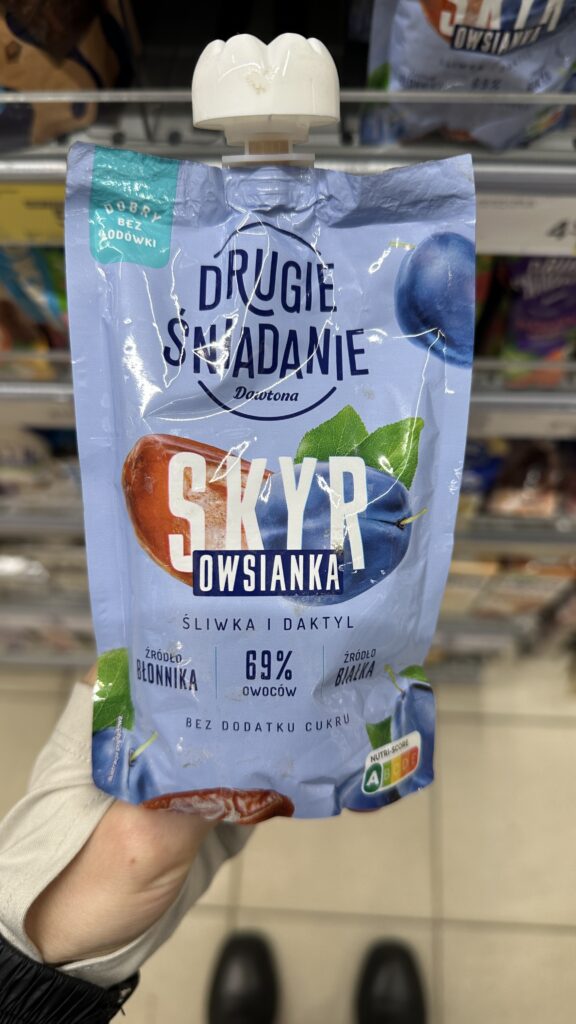
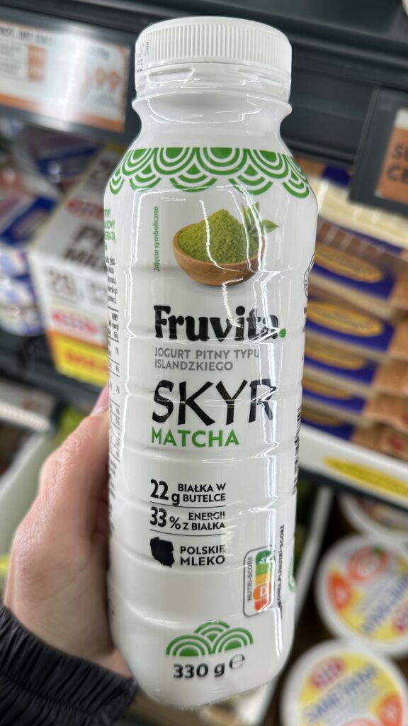
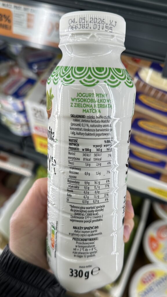
Skyr Drink
The combination of a high-protein Icelandic-style yogurt with this specific tea infusion is a brilliant move that targets the “modern achiever” persona—someone looking for functional health benefits (high protein) and a mental boost in a convenient, on-the-go format. While the packaging design maintains a clean, typical of Biedronka’s private label, the highlight of 22g of protein justifies the price point for the Polish market, where high-protein dairy remains a premium-yet-accessible staple for health-conscious consumers. This product successfully bridges the gap between a traditional snack and a functional supplement, making it a highly relevant addition to the competitive “fit” segment of local retail shelves.
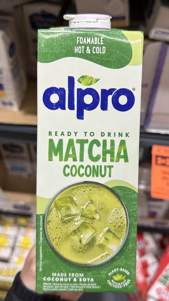
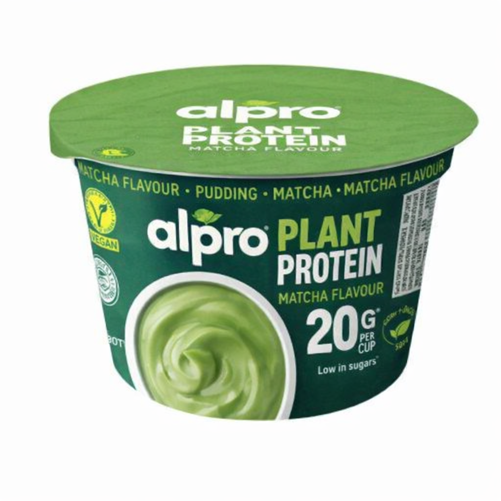
2. Plant Based Drink
This is a calculated move by Alpro to dominate the “home-barista” segment, offering a foamable, ready-to-drink solution that eliminates the hassle of manual mixing for the urban Gen Z and Millennial target who value aesthetic, plant-based lifestyle rituals. The vibrant, clean packaging design perfectly signals freshness and high-tier positioning. The product’s strength lies in its versatility—being equally functional for iced Summer drinks or hot lattes—making it a sophisticated, staple for the modern health-conscious pantry.
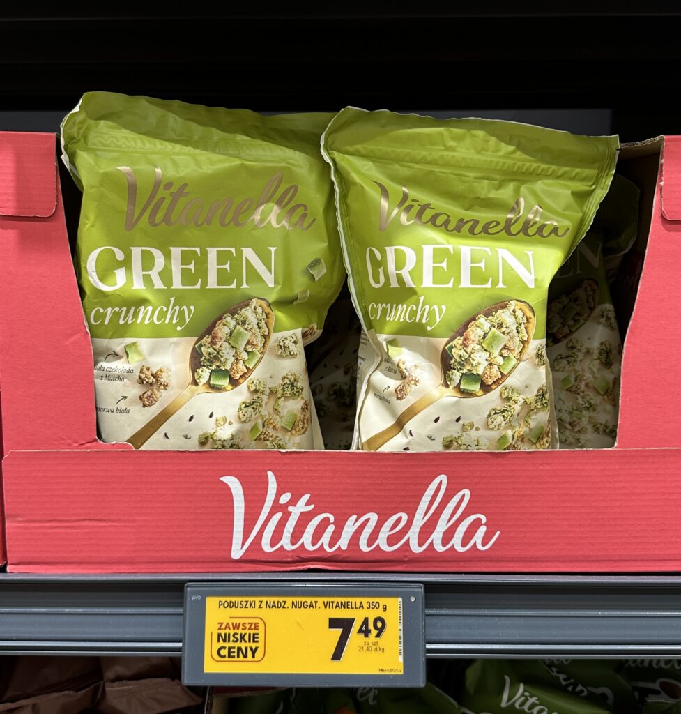
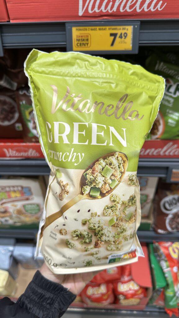
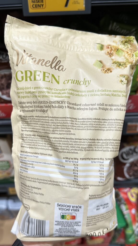
3.Muesli Crunchy
The inclusion of white chocolate with matcha and dried white mulberry in this crunchy granola creates a unique flavor profile that elevates a standard breakfast category into a more dessert-like experience. The soft green and cream packaging design effectively communicates a “natural” yet indulgent identity, standing out on shelves while maintaining the approachable brand recognition. Priced at 7.49 PLN for a 300g-350g bag, this product offers excellent value for the Polish market, successfully democratizing a trendy, cafe-style flavor combination for the mass consumer.
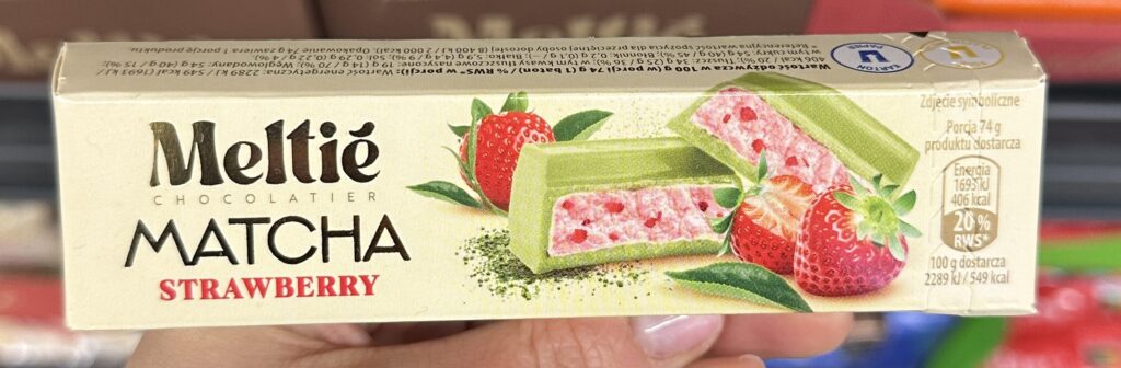
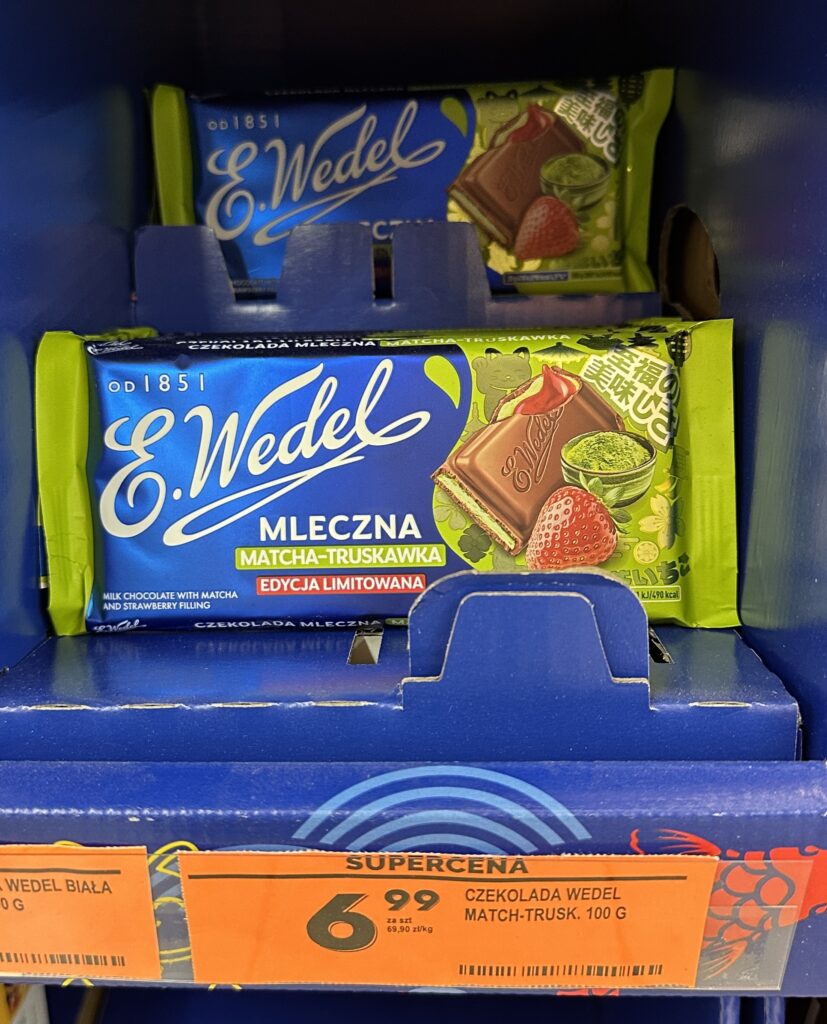
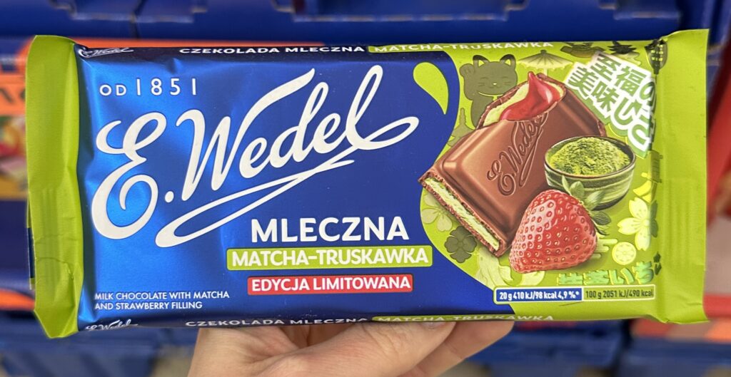
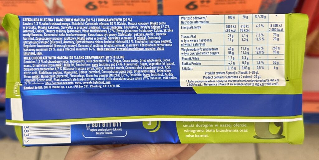
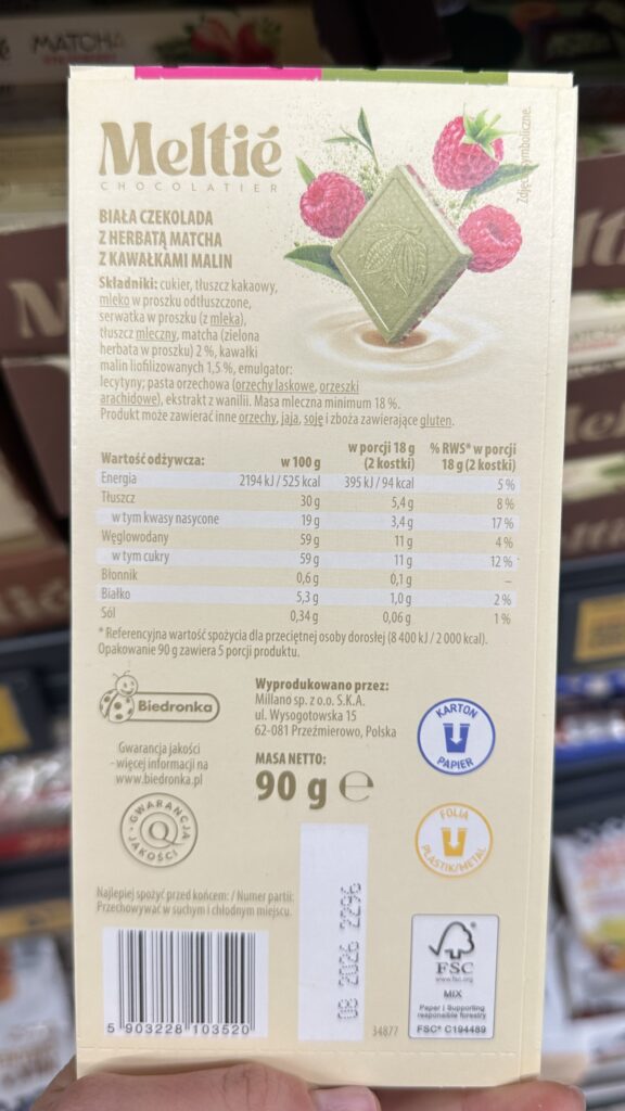
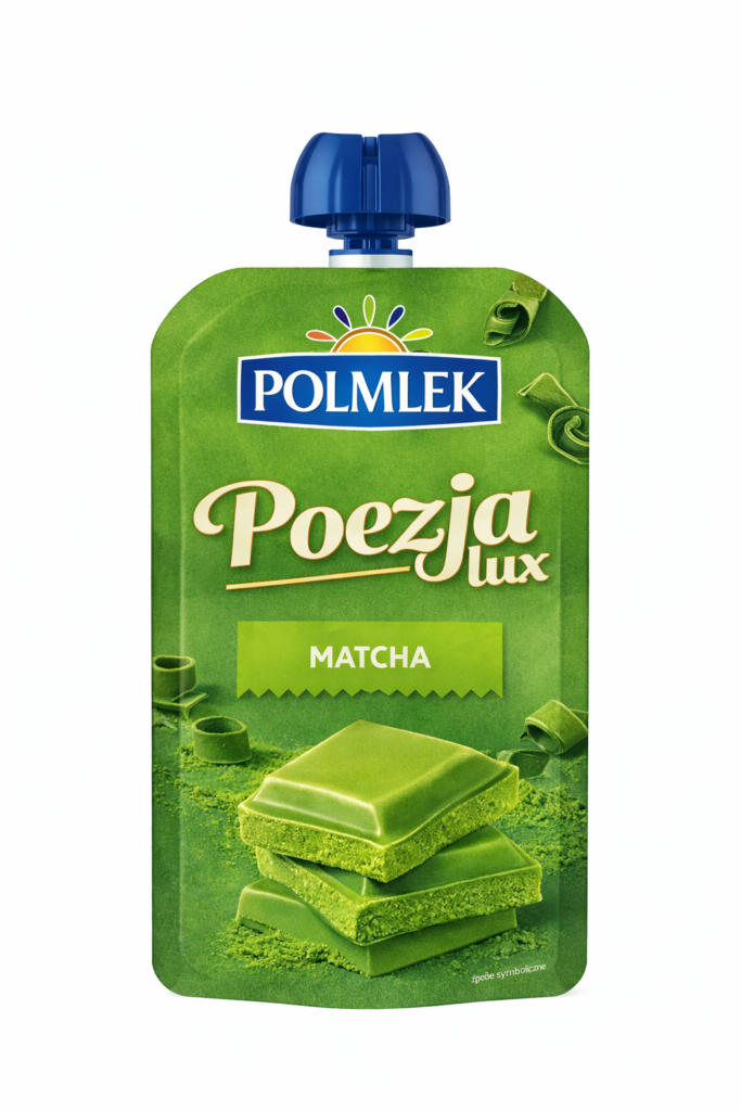
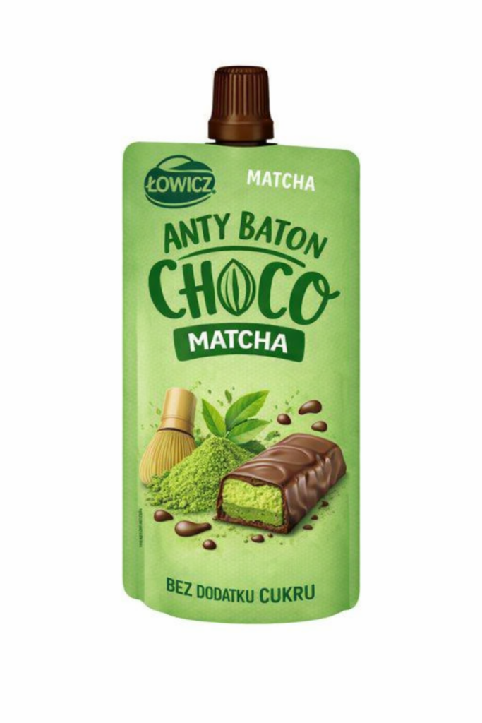
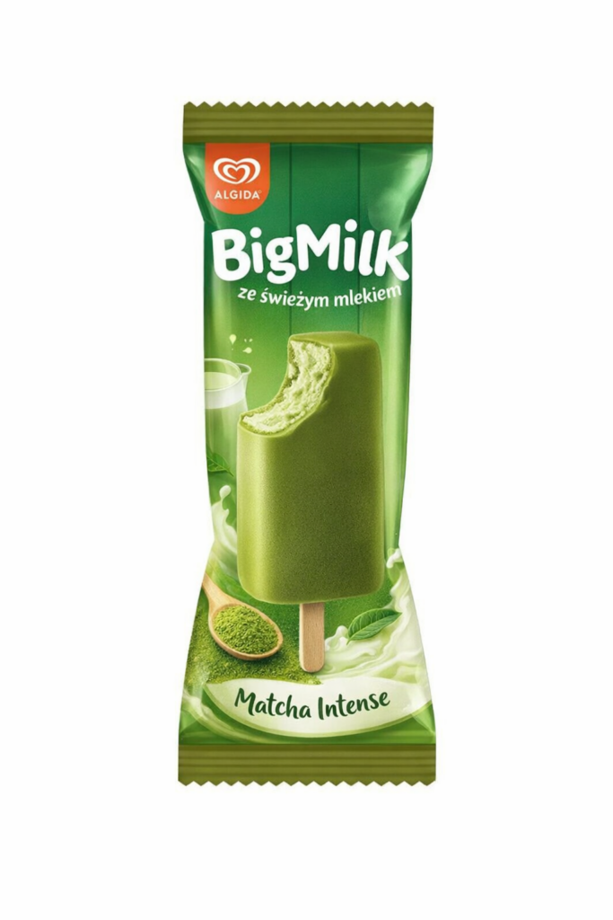
4. Chocolate table
E. Wedel’s limited-edition fusion of milk chocolate with strawberry and matcha filling is a masterclass in “oriental-chic” marketing, successfully blending traditional chocolate table with a trendy Japanese-inspired aesthetic. The packaging design is exceptionally vibrant, using pop-art illustrations and Maneki-neko motifs.
At a price of 6.99 PLN, it is positioned as an “affordable luxury” impulse buy, offering a high-perceived value that justifies the slight markup over classic flavor variants.
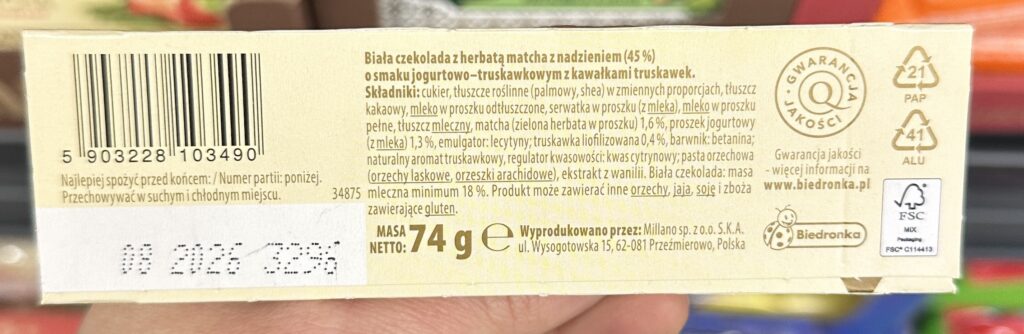
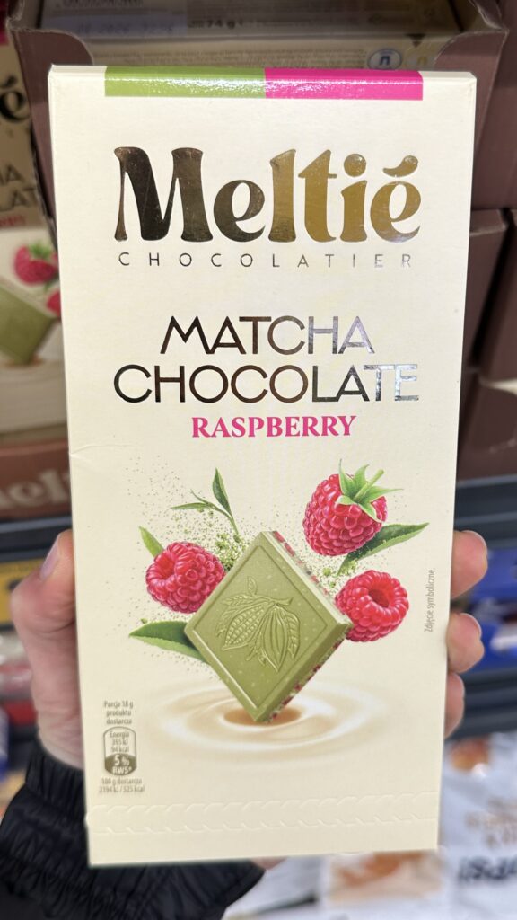
5. White Chocolate Bar
The pairing of a white chocolate-matcha shell with a yogurt-strawberry filling makes perfect sense as it balances earthy bitterness with creamy acidity, specifically targeting the price-sensitive “lifestyle explorer” as this is private label product. Carton remains in neutral colours, only “green” element is product display at the front. Given the 74g it is almost same as the traditional chocolate tables.
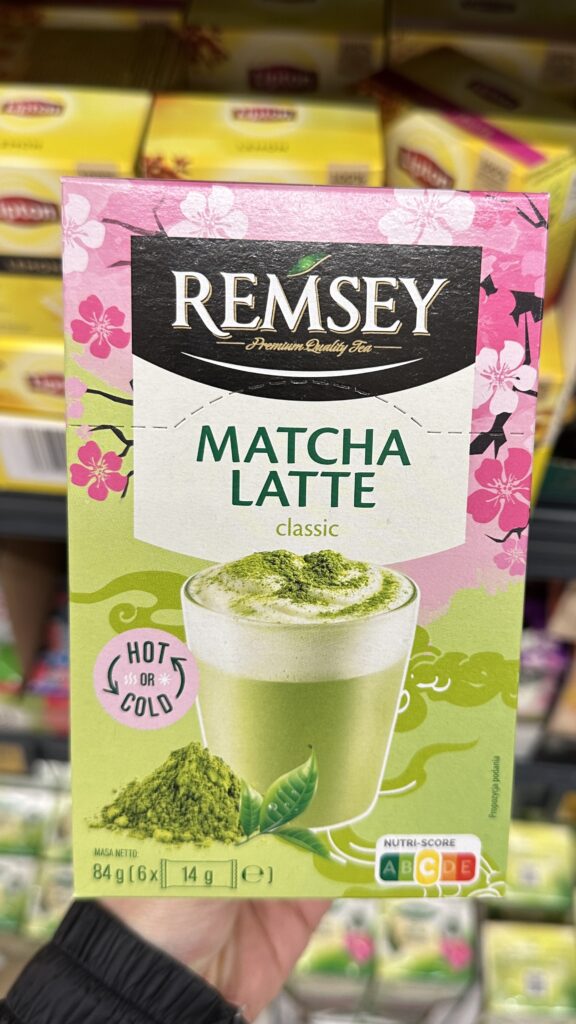
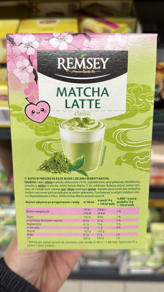
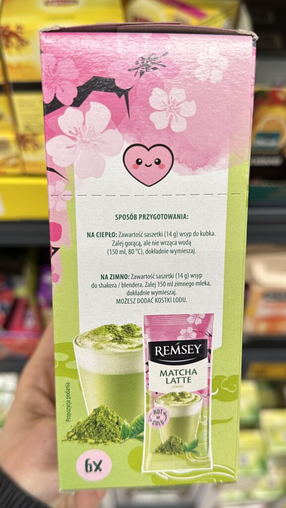
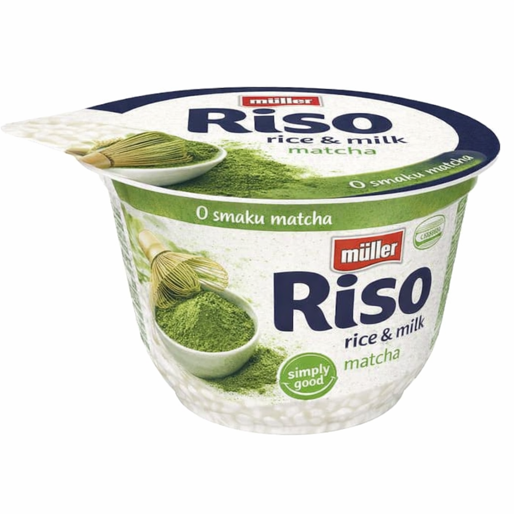
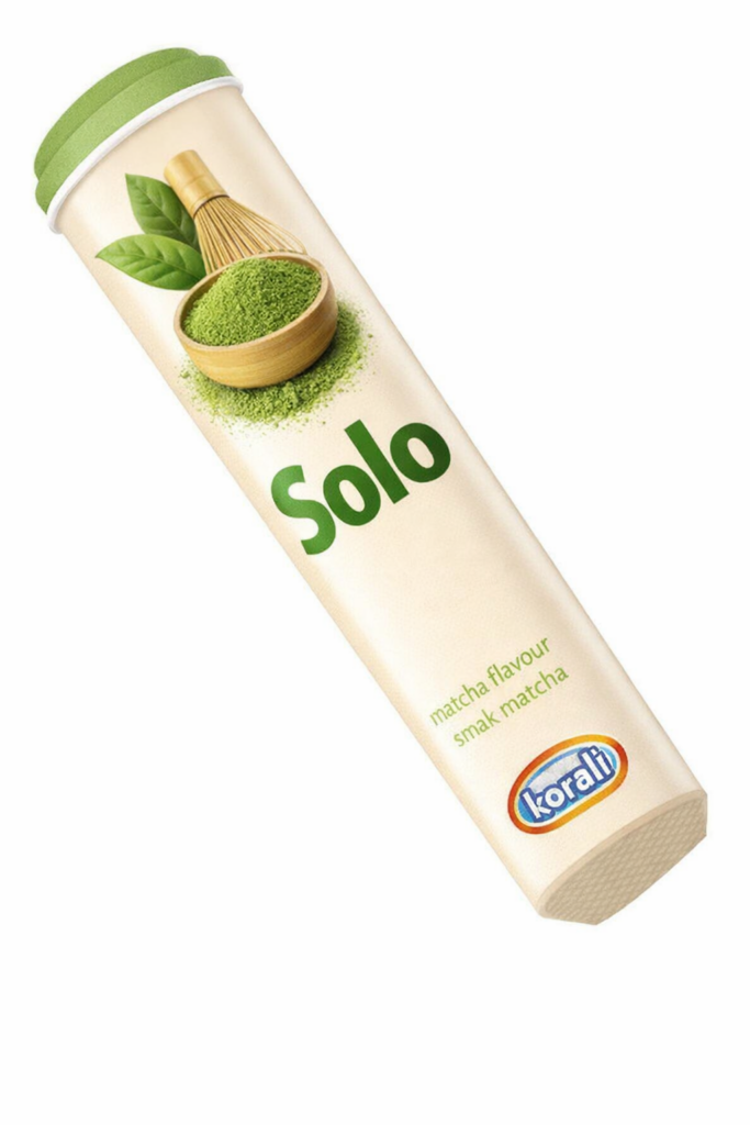
6. Matcha itself
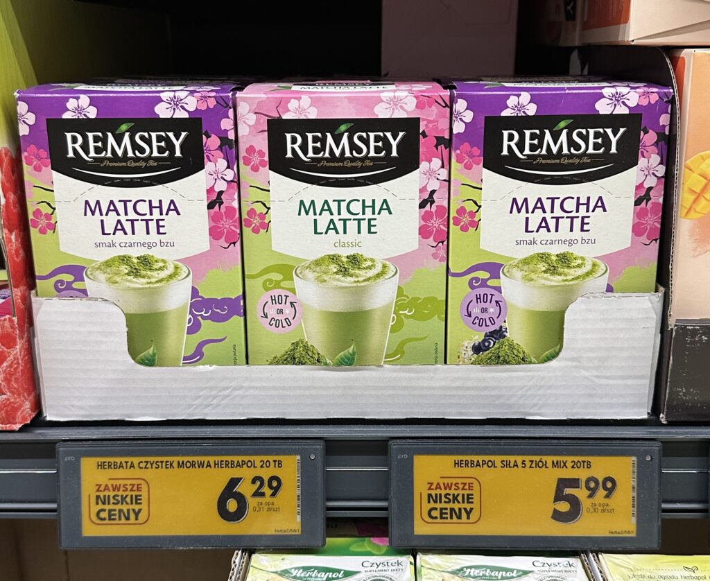
This is a smart market entry for Biedronka’s private label, offering a low-barrier way for mass-market consumers to experiment with trending café flavors at home without requiring specialized equipment or expensive milk alternatives. The target persona is a budget-conscious Gen Z or Millennial shopper who follows global wellness trends but prefers the convenience and pricepoint of a discount supermarket over a specialty coffee house. This product is highly reasonable for the Polish reality, as it offers a “luxury” café experience for a fraction of the 20+ PLN price per serving often found in cities like Warsaw. The packaging design is effective, utilizing “Kawaii” aesthetics and cherry blossom motifs to signal lifestyle appeal, while clearly communicating versatility through “Hot or Cold” preparation icons.
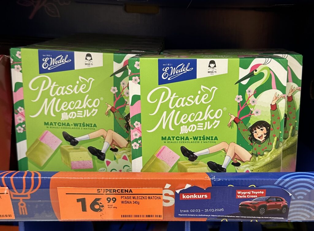
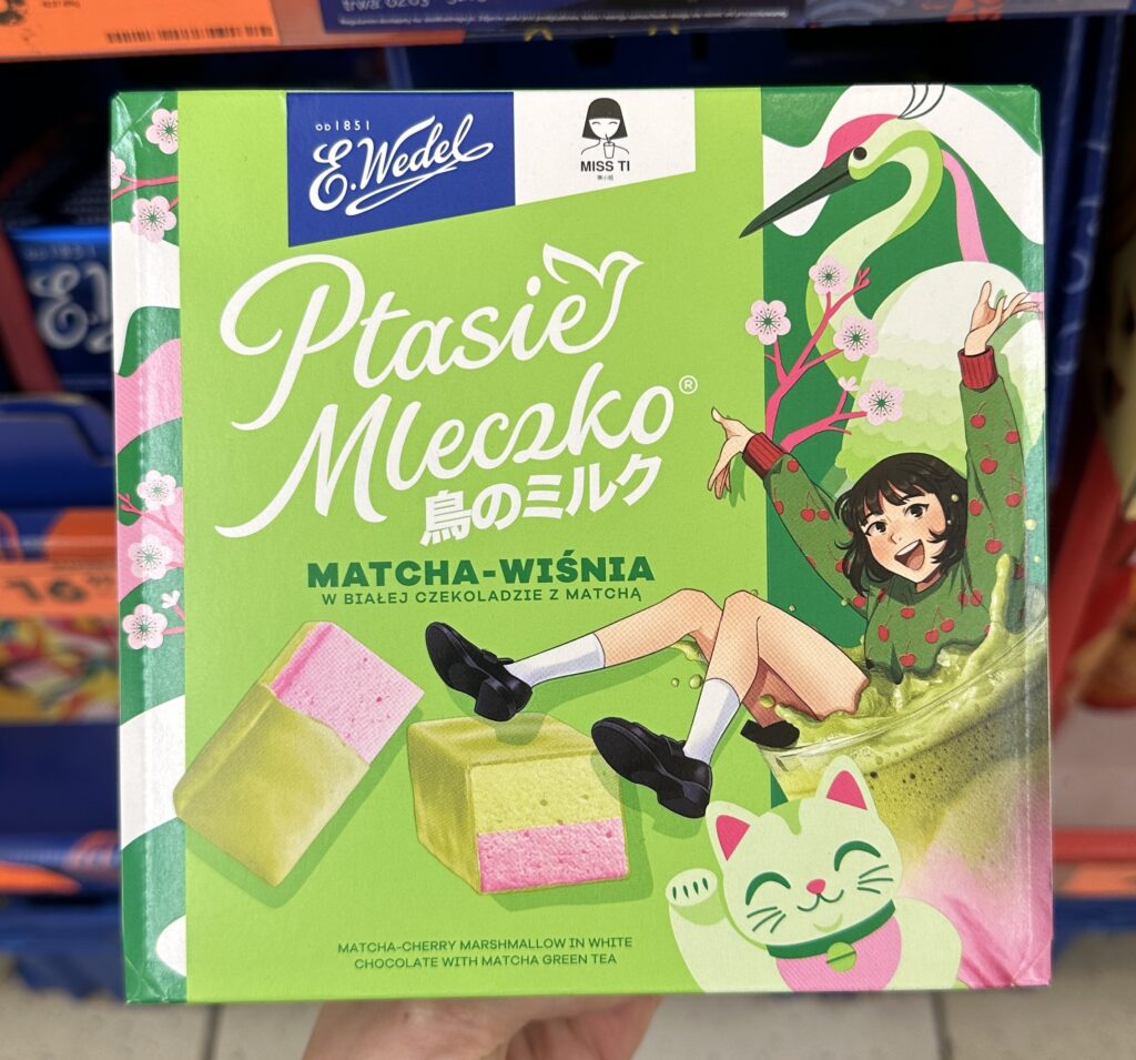
7. Soufflé Chocolates
This product successfully bridge the gap between a beloved Polish tradition and the modern “functional flavor” trend, though its execution leans heavily on visual novelty. The target persona is clearly the younger, “online” consumer who values aesthetic novelty, making the 16.99 PLN price point a reasonable “treat” for a limited-time experience. However, the packaging design is visually chaotic; it attempts to blend too many disparate elements—classical heritage branding, anime illustrations, and high-contrast color blocking—resulting in a cluttered hierarchy.
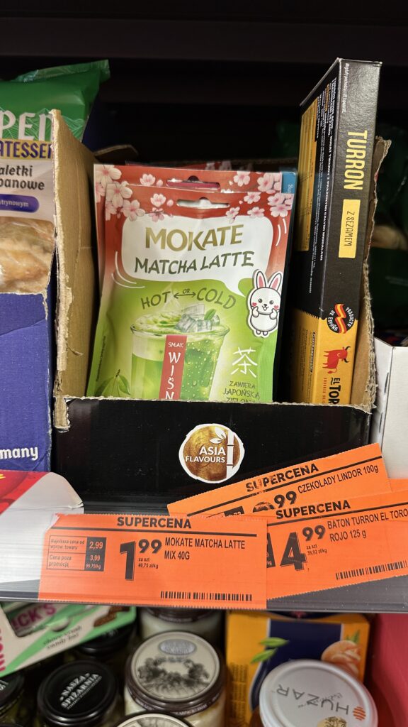
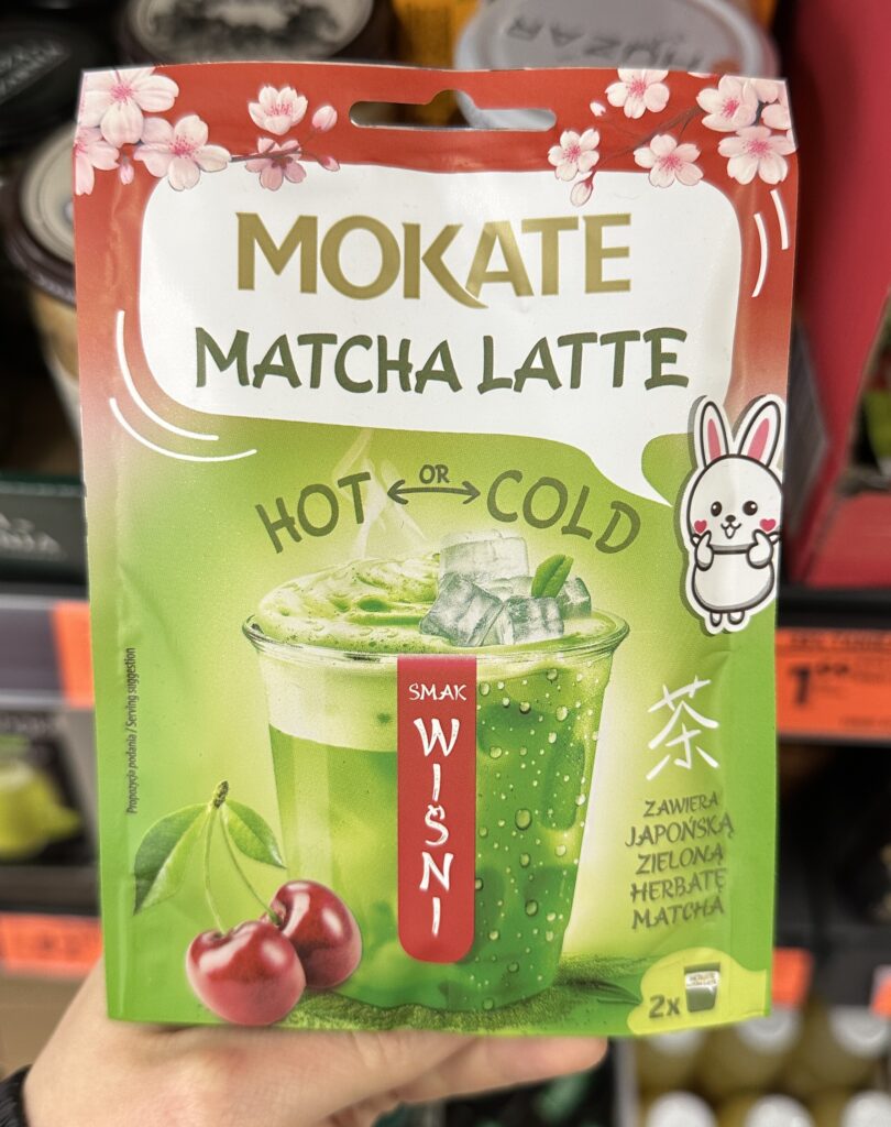
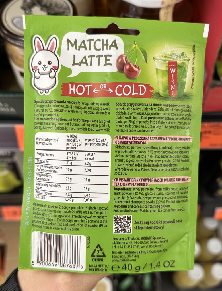
8. Matcha drink
This product is clearly designed for the “impulse buy” section, utilizing a logical yet nutrition-poor combination of instant flavoring and convenience that targets young, trend-driven shoppers looking for a “trend” rather than health benefits. Low entry price of 1.99 PLN—a highly reasonable, almost disposable cost for the Polish market, however, notice it is only 1 portion. Also, disappointing reality: with only 4% actual tea content and a primary ingredient list of sugar and glucose syrup, the “wellness” promise of the tea category is completely overshadowed by a synthetic, high-calorie profile that prioritizes shelf-stable sweetness over quality.
The design is a textbook example of “visual indecision”, creating an aesthetic clash by placing a hyper-realistic cherry photo alongside a simplified cartoon bunny and traditional Japanese calligraphy. The red-and-green color scheme, while intended to represent the cherry flavor, leans dangerously close to a “tomato juice” palette, which fails to harmonize as effectively as a pink-and-green “sakura” theme would.
9. White chocolate table
This product is a “premium-wash” specialty chocolate that successfully uses a sophisticated flavor combination to mask a relatively low inclusion rate of its headline ingredients, making it an excellentmargin-driver for the manufacturer. It targets the “affordable luxury” persona—likely a middle-class shopper looking for a sophisticated evening snack or a quick self-indulgent purchase—who is easily swayed by the elegant, minimalistpackaging featuring gold foil lettering and clean typography. While the design looks high-end, the reality is a classic case of marketing inflation, as the 30% price markup over standard chocolate is built on just 2% low-quality powder and a tiny fraction of fruit.
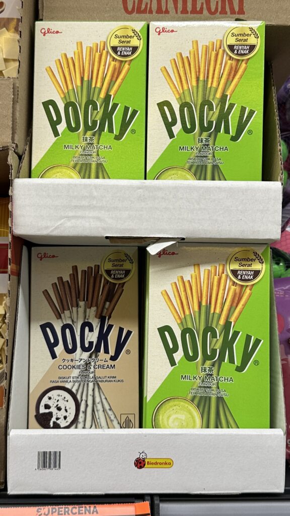
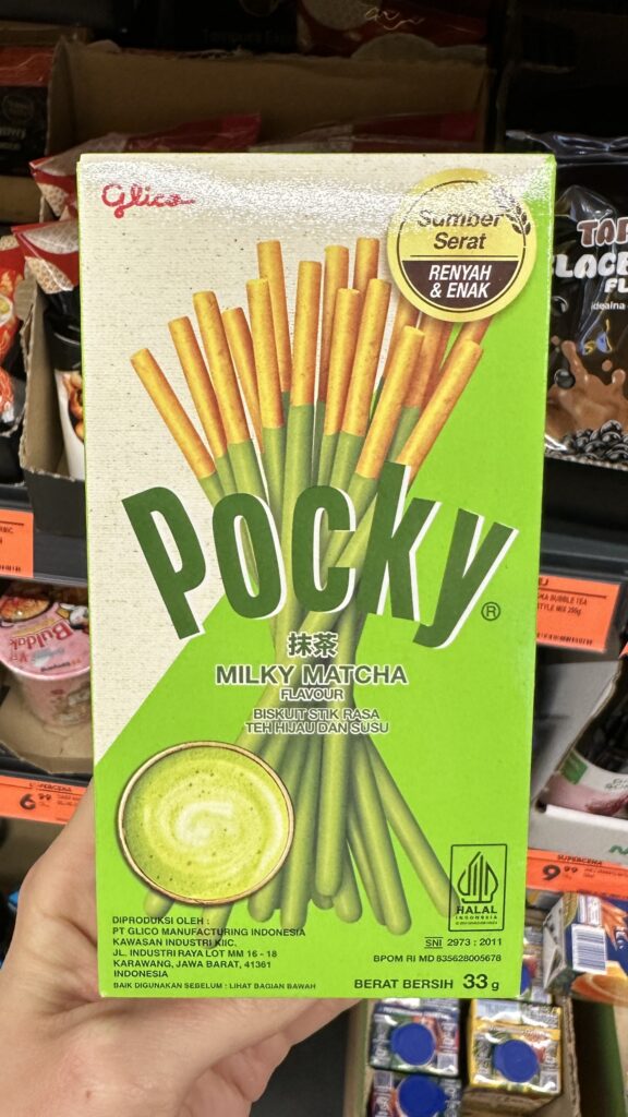
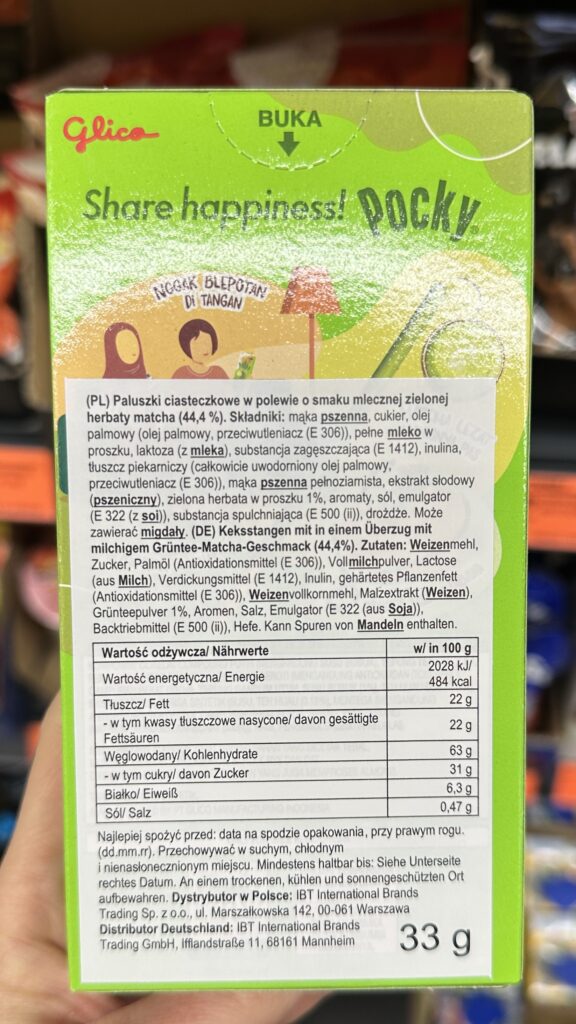
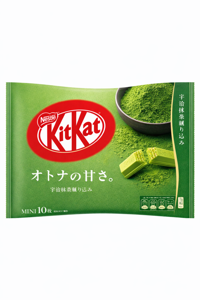
10. Chocolate cookie sticks
While Pocky is an iconic global snack, this version featuring a matcha profile is a textbook example of a “global curiosity” product that feels somewhat out of place in a standard Polish discount aisle due to its hyper-localized Southeast Asian branding. The combination of a crunchy biscuit with a sweet, grassy coating is a proven winner for the “snack-adventurer” or K-pop/J-pop fan.The pricing for such a small “import” item remains a premium compared to local snacks.
Where are still opportunities
I see multiple opportunities to use this matcha trend to win in multiple categories.
First what come to my mind is dairy/plant-based desserts. Relatively easy to achieve, fast moving good, ideal to adopt to seasonal matcha trend.
My top pick? Monte. It captures that sweet spot of Gen Z nostalgia while refreshing the profile for a more “grown-up” palate.
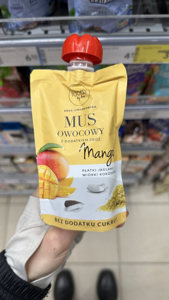
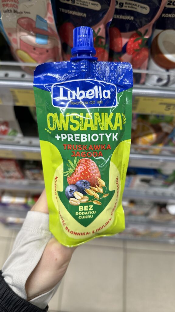
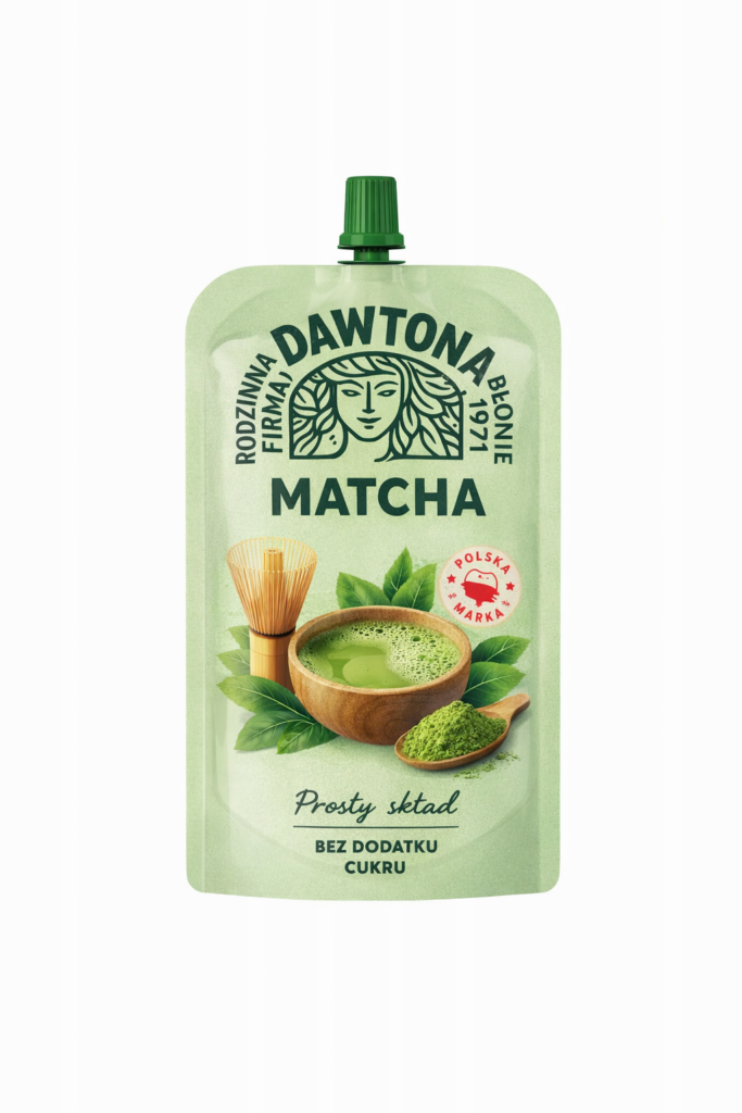
My next bet on easy-to-create, easy-to-bring-to-market products would be pouches.
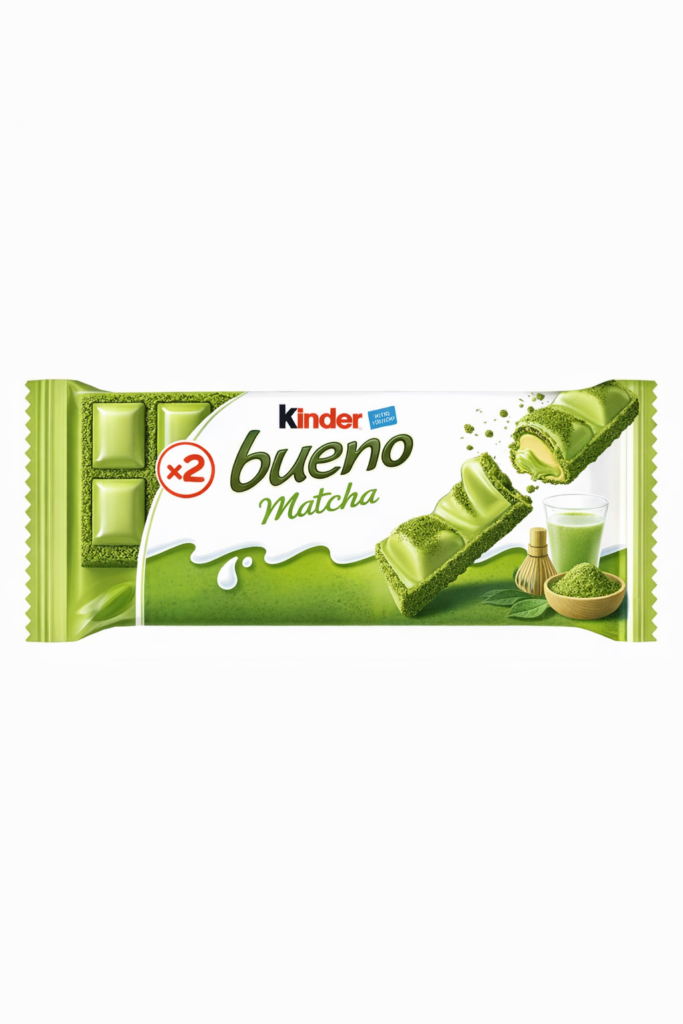
Currently I think there is missing piece on bars which are known well but in a seasonal limited edition witch matcha flavour.
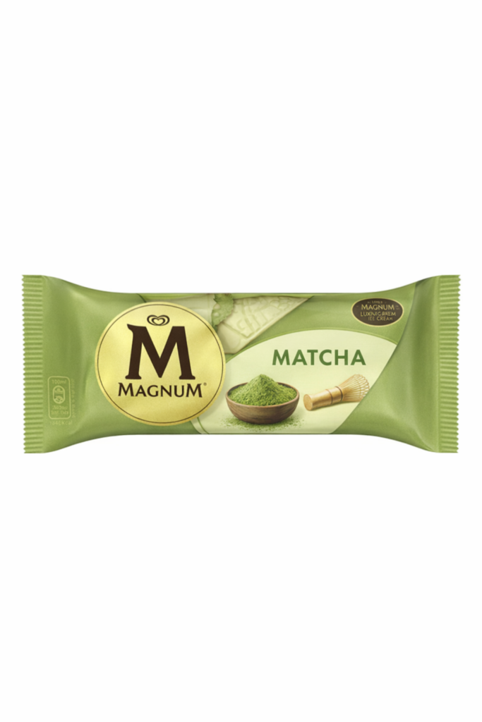
Soon, we start ice cream season – another segment that is just waiting to hit with green energy.
Summary
The “Green Rush” of 2026 is more than just a color shift on the shelves; it is a litmus test for agility in the FMCG sector.
The winners will be the brands that successfully integrate matcha’s earthy profile into a functional benefit—like the high-protein Skyr—or those that leverage deep-seated emotional triggers.
What’s Next?
As we navigate the rest of the year, keep an eye on the “chilled zone.” This is where the highest velocity meets the highest trend-sensitivity. If you aren’t already planning your seasonal LTO (Limited Time Offer) around a balanced, high-quality matcha flavor, you’re leaving shelf space to the competition.
Is matcha a permanent staple or a passing cloud? In the world of fast-moving consumer goods, the answer doesn’t really matter as long as you are the first to the checkout zone with a product that resonates. The “Green Obsession” is here for now—it’s time to make it work for your margins before new trend will kick in.
Order pattern looks irregular—so irregular that your first reaction is:
“This is intermittent demand; forecasting will be messy.”
And yes, sometimes it is.
But in many cases, it’s not “absolutely irregular.” There are patterns. The problem is that we often look for the wrong ones.
Let me walk through a case I’ve seen more than once—and why a standard forecasting approach can produce horrible accuracy, even when the demand is actually quite structured.
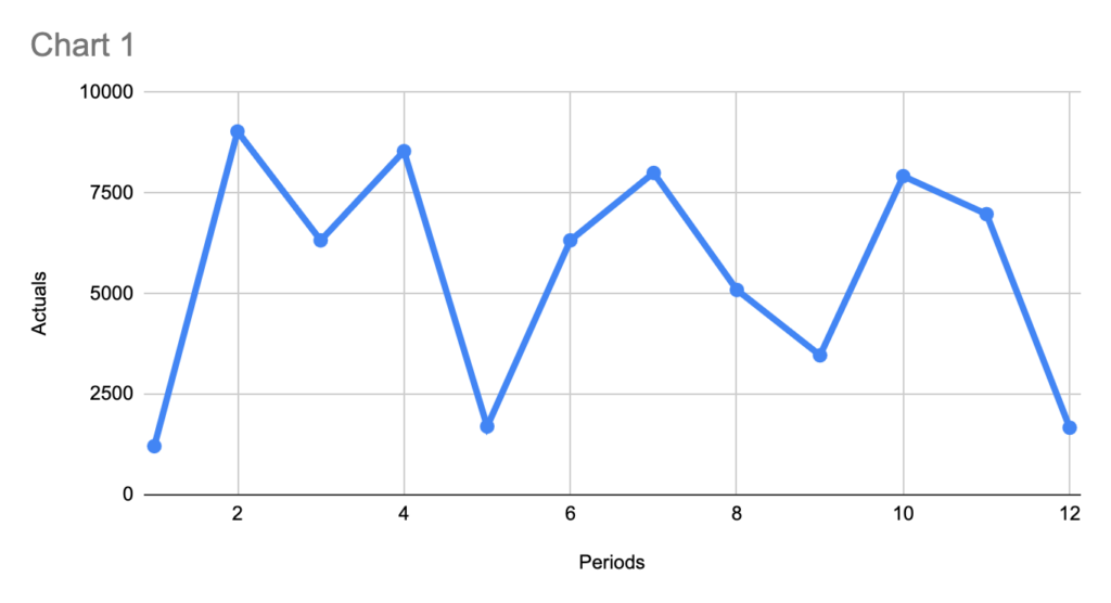
Pattern #1: Irregular timing, but a stable weekly “envelope”
At first glance, the orders arrive at inconsistent intervals. One week you get a hit, next week nothing, then two dips close to each other.
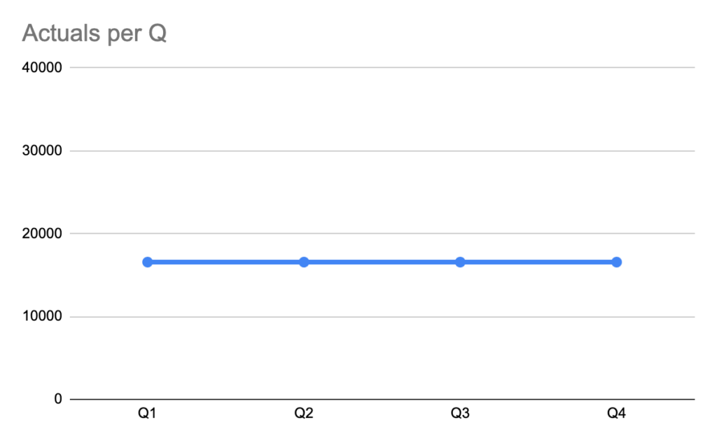
Still, when you zoom out, you often see an estimated volume of demand per quarter that is stable. Look at same data on Quarterly granularity:
In other words:
Order timing is irregular
But average quarterly throughput is not crazy
Pattern – straight-forward. But only if you zoom out.
Pattern #2: Volumes repeat — because quantities are discrete (not continuous)
Some SKUs are ordered only in a specific base quantity (a “base unit”), always.
If the customer makes an order, it is always:
exactly the Base Unit, or
a clean multiple of it
Example :
In such a case, making statistics on “number of kg” as if it were a smooth continuous variable often makes no sense. The demand is quantized.
So even if your weekly forecast is “close” in an average sense, it can still be operationally wrong because it predicts values that cannot happen in reality (e.g., 1433 kg when the only feasible outcomes are 792 or 1584 kg).
This is a classic planning trap:
Forecast looks mathematically reasonable
But it violates the ordering grammar of that SKU/customer combination
Result: big errors, low trust, bad downstream decisions (inventory, production, transport planning)
Why does this happen?
Because the demand you observe is not purely consumption-driven—it’s consumption filtered through ordering constraints, such as:
pack size / layer / pallet multiples
minimum order quantities (MOQ)
full-truck or delivery-slot economics
internal customer ordering habits (“we always order 2 pallets”)
system constraints (ERP rounding, UoM conversions)
The “real” consumption may be smoother, but your order history is a rounded and batched signal. Can SAP IBP help? Yes, in concept—sometimes not in practice
A potential solution direction is using Time Series Properties in SAP IBP (feature engineering for time series):
In general, the concept is great: it encourages you to explicitly describe characteristics of the series and derive smarter features.
But here’s my observation from the field: The limitation: it may not catch “base-unit multiple” demand
These discrete-multiple patterns are not just seasonality, trend, or noise. They’re more like a rule-based quantization of order quantities.
If the feature framework doesn’t explicitly detect and represent “order quantities come in multiples of X,” then:
the model can still average across outcomes
and it will keep producing “in-between” numbers that never occur
Practical way to think about it (what usually works better)
If I had to summarize the right mental model: Don’t forecast “kg” first. Forecast the ordering mechanism.
A robust approach is usually two-layer:
When will an order occur? (order event / probability)
If an order occurs, how many base units will it be? (1x, 2x, 3x…)
Then convert back to kg if needed.
Even without building a complex ML stack, you can often improve results by introducing a simple constraint/post-processing step:
detect the base unit from history (e.g., most common divisor or most frequent quantity step)
forecast demand level
then snap/round the forecast to the nearest feasible multiple (with sensible business rules)
This alone can drastically reduce “nonsense forecasts” and improve planner trust—even if your underlying model doesn’t change.
Final thought
“Irregular orders” is often a misleading label. Many series are irregular in timing, but highly regular in allowed quantities. If you ignore that discreteness, you can spend months tuning models and still get terrible accuracy—because the model is solving the wrong problem.
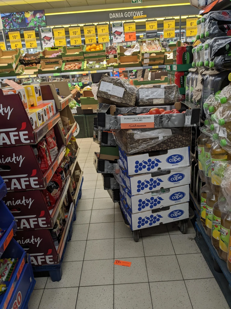
Walk into a typical discount or grocery store in Poland today and something feels off almost immediately. Not because of pricing (maybe this can hit you if your last visit in PL was in 2003), not because of assortment—but because of space. Or rather, the lack of it.
Aisles are no longer corridors designed for flow; they have become obstacle courses. Cardboard displays rise unexpectedly at every turn, clip strips hang into walking paths, and promotional towers compete for every available square meter. The shopping act, once routine and almost automatic, turns into a careful navigation exercise.
We often talk about the “Golden Zone” on a shelf, but in many Polish stores, the floor has become the new battlefield. When you see temporary displays (FSDUs/shippers) blocking every turn, it’s usually because the store manager is caught between two fires: HQ-negotiated contracts that mandate these displays and a “backroom” that is already overflowing.
The sense of chaos is a psychological “stop sign” for shoppers. When a shopper has to physically protect their body or bag from knocking over a tower of energy drinks, their cortisol levels rise. A stressed shopper buys only what is on their list and flees, which is the exact opposite of what an extra exposition is supposed to achieve.
The Fridge vs. Ambient Paradox
Let’s look at UHT milk or ambient beverages. Chilled square footage is the most expensive “real estate” in a store due to electricity and maintenancecosts. Using it for products that don’t require it (just to get a “double hit” of visibility) is a massive inefficiency for the store owner. It limits the assortment of high-margin, short-shelf-life innovations like
plant-based yogurts
dairy products
fresh convenience meals
juices fresh-pressed
etc
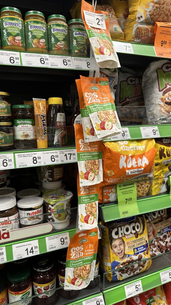
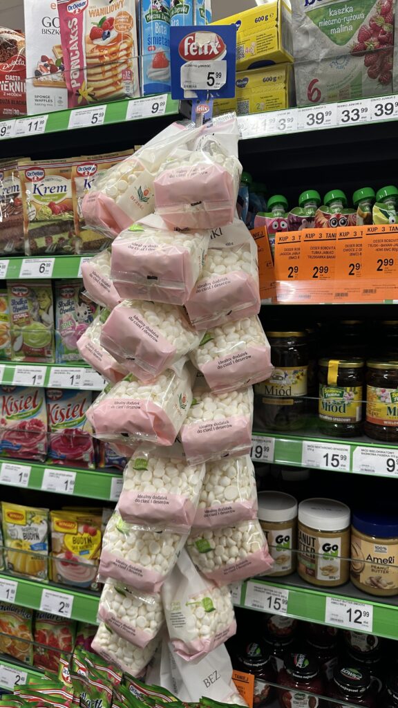
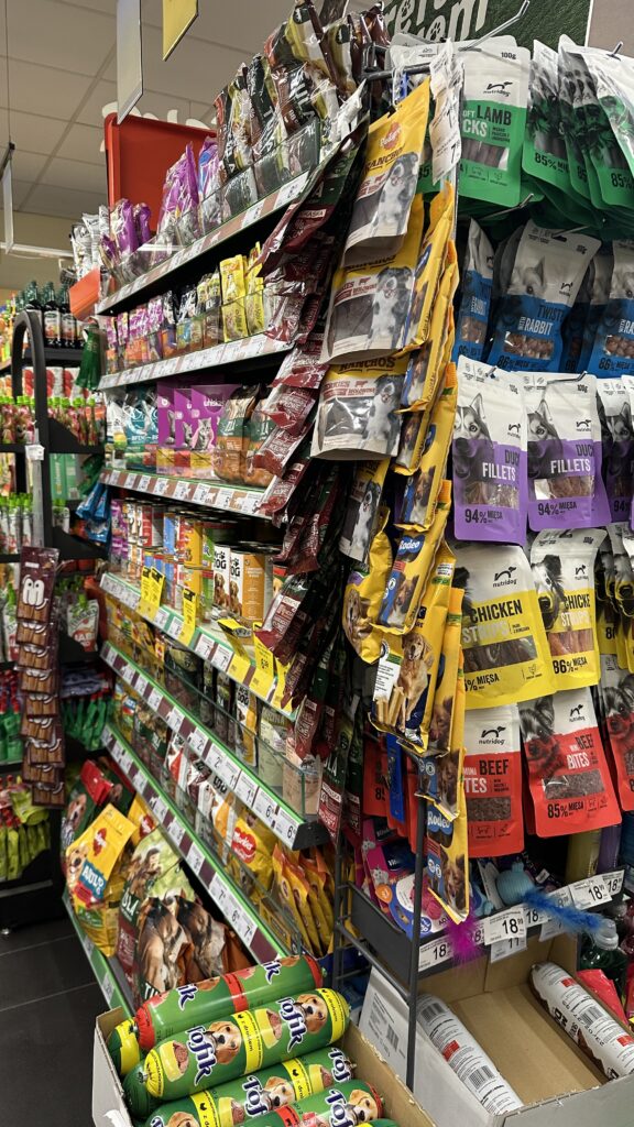
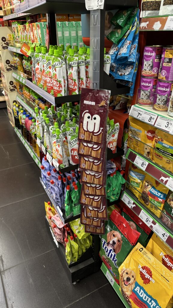
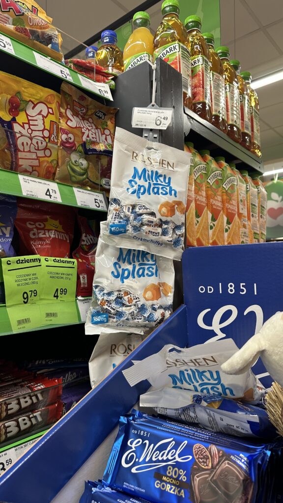
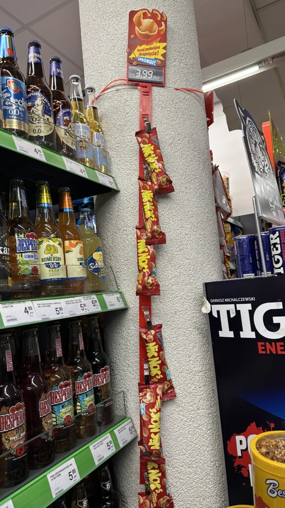
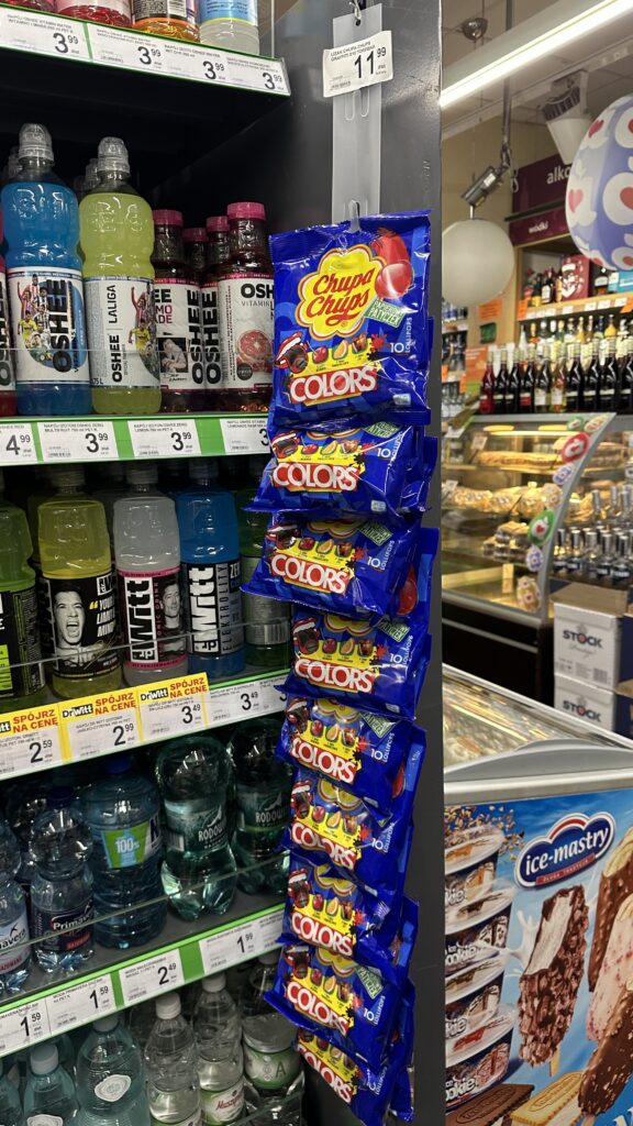
The Clip Strip “Infection”
The next observation is every shelves covered with clip strip. Or rather clip strips. This is a symptom of “Micro-Space Greed.” These strips are designed for cross-merchandising (e.g., batteries next to toys). However, when they are everywhere, they become “visual noise.”
Taking the regular product from shelve without disruption is almost impossible. They are the first things to get knocked down, creating a look of a “discount graveyard” rather than a professional retail environment.
This is observation from just 1 visit in a small grocery store:
oatmeal
mini meringues (this packge is too large to hang this way!)
pet food
jelly beans and pet food (isn’t it affecting the quality of product?)
milky candies
crispy peanuts
lollipops
dried fruits
fabric stain remover and bread sticks (this shocked me! I wasn’t even considering such kind of product to hang on this display)
If you put attnetion in two of those examples we already see cartoon display blocking the shelve access (picture of milky candies and dried fruits)
Who Needs to Intervene?
This issue probably could be solved only by one of those:
The Fire Marshal (Straż Pożarna): This is the most immediate lever. Polish health and safety (BHP) and fire regulations are quite strict regarding the minimum width of evacuation routes. If a store’s “extra expositions” reduce a corridor below the legal limit (often 1.2m to 2.0m depending on the store size), they are in violation. More frequent inspections would force retailers to clear the “death traps” they’ve built out of cardboard and plastic.
Retail HQ (Category Managers): The “Commercial Team” needs to start talking to the “Operations Team.” Currently, HQ sells the floor space to producers without checking if the physical store can actually hold it. They need to implement “Display Caps”—a hard limit on the number of secondary placements allowed per square meter.
The Consumer (The Power of the Wallet): If shoppers move their loyalty to stores that prioritize “breathable” shopping the cluttered stores will see their “Time in Store” metric drop, which eventually forces a change in strategy. As pepole understimate the risk of potential accident due to overcrowd stores and they are looking for every opportunity to buy with lowest prices I think it is not likely to happened.
We are reaching a tipping point. What is gonna happened if stores continue to prioritize “temporary stimulus” over “basic navigation,”? Will they lose the modern shopper who values time and comfort over seeing the same UHT in four different places? Or lowest price will always win no-matter-what?
Navigating the Most Volatile Window in the FMCG Calendar
Easter is arguably the most complex period for any Forecasting or Demand Planning team. In my >5 years of international FMCG experience, I’ve seen even the most sophisticated systems stumble during this “moving feast.” To manage it successfully, you need more than just data—you need a deep understanding of the “Pattern” and the logistical friction that occurs behind the scenes.
The “Moving Target” Problem: Why Algorithms Struggle
The primary challenge of Easter is its timing. The earliest possible date is March 22nd (Week 12), and the latest is April 25th (Week 17). This five-week variance means that seasonal patterns cannot simply be “copied and pasted” from the previous year.
While a human planner looks at the calendar and thinks,
Ah, spring is here—Easter is coming,
a standard Machine Learning algorithm often fails to make that connection unless it is fed specific Independent Variables. Without a “Holiday” indicator or a system linked directly to global calendars, AI cannot proactively find these dates without human intervention. To get a reliable forecast, your Advanced Planning System (APS) must be “taught” that these weeks are outliers.
The Cluster Complication: Navigating Regional Rules
Planning becomes significantly “messier” when you manage a cluster of countries rather than a single market. Take Iberia, for example:
Spain: Thursday and Friday before Easter, and Easter Monday are off*
Portugal: Friday before Easter is off.
*depending on the region
When estimating the impact, you must reflect the specific portfolio weights of each country within the cluster. In reality, it’s even more granular: only certain regions might have bank holidays, and only specific locations may be operating. This makes it incredibly difficult to estimate a “blanket” impact at the country or cluster level. You must layer in seasonality, store traffic, changing consumer habits, and even the weather (which dictates whether people buy chocolate eggs or ice cream).
Operational Friction: The Warehouse vs. The Office
There is often a disconnect between the “white-collar” plan and the “blue-collar” execution. The head office might be closed, but autonomous or highly automated warehouses might operate 24/7, even adding Saturday shifts to clear the backlog.
It is vital to have the functionality in your system to flag specific Distribution Centers (DCs) that are making orders. We need to know exactly which nodes are generating shipments to ensure the “Golden Triangle” of Cost, Service, and Inventory remains balanced.
The 7-Step Strategic Recommendation: Keep the Conversation Going
Success in Easter planning isn’t a “set and forget” task; it requires a recursive S&OP (Sales & Operations Planning) cycle. Depending on your product’s shelf life and market specifics, I recommend this flow:
Gather Information: Collective data from Sales, Marketing, and Supply.
Conflict Detection: Identify where there are biggest conflicts issues (example – demand exceeds capacity)
Conflict Resolution: Finding the “middle ground” solution.
Alignment & Summary: Ensuring every department is on the same page.
Implementation: Lock the strategy into the execution system.
Results Review: Real-time tracking of the “Go-Live.”
Post-Mortem Analysis: Capturing the “Lessons Learned” for next year.
What Usually Goes Wrong?
In the heat of the season, several execution traps tend to emerge. I’ve categorized these from my years in the field:
Manufacturing & Supply Chain Hurdles
Late Labels: Seasonal packaging or labels delivered to the factory too late for the production window.
Design Delays: Packaging artwork sitting with designers while the production line waits.
The MOQ Trap: Minimum Order Quantities on seasonal SKUs forcing you to produce more than the market can absorb.
The FIFO Conflict: Because of “First-In, First-Out” rules, warehouses ship regular products first, while the seasonal “Easter-labeled” stock sits at the back until it becomes obsolete.
Capacity Blocks: Running a seasonal SKU often prevents the factory from producing the regular products.
Shelf-Life Overproduction: Sites fearing a stock-out might overproduce regular items, leading to “short-coded” stock that customers refuse to accept.
Warehouse & Logistics Constraints
Resource Scarcity: Failing to estimate the exact manpower needed—leading to either a “bottleneck” where shipments can’t leave or “idle time” where staff have no work.
Space Limitations: Most warehouses aren’t built to store a double inventory (both regular and seasonal peaks) simultaneously.
Fragility Issues: Chocolate figures (bunnies, eggs) are hollow and easily crushed. Their value is entirely in their shape; if the “protection” fails, the product is worthless.
The Transport Limit: You might have the stock and the people, but are there enough trucks? The market for freight tightens significantly during holiday peaks.
Co-Packing & Retail Challenges
Display Readiness: Seasonal SKUs meant for secondary placements (displays/shippers) aren’t ready when the co-packer needs them.
Transit Damage: Fragile cardboard displays often arrive at the store destroyed, leading to poor “on-shelf” execution.
The Customer Complaint: Retailers refusing to take seasonal labeled products too early—or too late—leaving you with a stranded stock.
The Demand Pattern: The “Before” and the “After”
Forecasting must analyze the pattern of orders across several years to estimate the “Easter Curve.”
The Lead-Up: Key Accounts must feed Marketing activations and S&OP cycles with clear data on when the peak starts.
The Post-Easter “Dip”: For categories like sweets and chocolate, expect a slump. People have “leftover fatigue.”
The Post-Easter “Peak”: For staples like dairy, fruit, and fresh ready-to-eat meals, there is often a massive “refill” peak as consumers replenish their empty fridges.
The Human Aspect: Changing Lifestyles
Easter planning isn’t just about the holiday; it’s about the break in routine.
The School Effect: Kids leave school earlier. This causes an immediate drop in demand for products in vending machines and school kiosks.
The Fresh Clear-Out: Distributors of fresh or dairy products will stop ordering much earlier to ensure they have zero waste during the “off” period.
Remote Work & Travel: Many people take the days before Easter off or work remotely. If your product relies on “commuter traffic” (like office snacks or gym drinks), you must account for this migration.
Know Your Portfolio: The Three Types of Easter SKUs
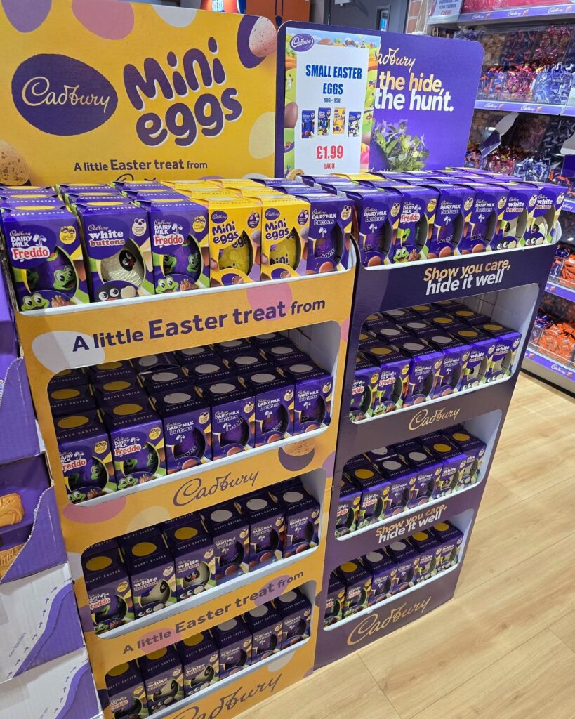
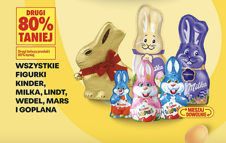
Finally, remember that not all products are created equal during this time:
Seasonal SKUs (In-Outs): Pure holiday products (e.g., Lindt Gold Bunny). They must appear and then disappear instantly.
Seasonal Labeled SKUs: The same product inside, but with a festive “Easter coat” (e.g., Baking Soda with a rabbit on the pack).
High-Demand Staples: Standard SKUs that simply explode in volume due to tradition (e.g., Ricotta in Italy or Eggs in Poland).
Easter is a beautiful time for celebration. But for a professional planner, the real joy comes from a “Green KPI” dashboard on Tuesday morning, knowing that through collaboration and meticulous detail, the business went smoothly while everyone else was enjoying their break.
The collective packaging carton—often referred to as Shelf-Ready Packaging (SRP) or Retail-Ready Packaging (RRP)—has evolved from a mere shipping necessity into a critical touchpoint of the shopping act.
In modern retail, particularly within discounters like Aldi or Lidl, store staff rarely unpack individual units. Instead, the entire carton is placed directly onto the shelf. This means the carton is the “first face” the consumer sees. If designed poorly, it becomes a barrier; if designed brilliantly, it acts as a silent salesman that bridges the gap between a logistics necessity and a marketing powerhouse.
The primary function of any collective packaging is protection. It must safeguard the product through an impressive journey: from the high-speed vibrations of a factory conveyor belt to the stacking pressures in a Distribution Center (DC), and finally, the manual handling during store replenishment.
A carton that collapses under its own weight or tears during transit doesn’t just damage the product; it damages the brand’s perceived quality before a customer even touches it.
The engineering must ensure that every centimeter of corrugated board provides maximum vertical strength while remaining easy to open without any sharp tool, which could accidentally puncture the primary pouches inside.
The Human Factor – UX for Store Staff
We often overlook the “internal customer”—the store staff. If a case is difficult to grip, lacks clear “this side up” indicators, or has a perforated opening that requires a Herculean effort to tear, it will be handled roughly. Poorly designed cartons lead to “shelf-gore,” where jagged cardboard edges or half-torn flaps obscure the product.
A staff-friendly design includes intuitive hand-holes and “easy-open” features that allow for a clean, one-motion removal of the hood. When the staff finds a carton easy to work with, the product is more likely to be replenished promptly and positioned correctly on the shelf.
The Shopper’s Perspective: Frictionless Interaction
From a User Experience (UX) perspective, the carton must facilitate an effortless “grab-and-go” motion. We want to eliminate any physical tension at the moment of the buying decision!
If the front lip of the carton is too high, it hides the product itself, it is difficult to grab it quickly;
if it is too low, the products might tumble forward.
The ideal design uses a “low-cut” front that showcases the primary packaging while providing enough of a “tray” to keep the units upright and organized.
This ensures that even when the carton is half-empty, it doesn’t look like a chaotic bin of discarded items.
Marketing on the Edge: Eye-Catching Communication
The outer layer is prime real estate for marketing. In a sea of brown or white cardboard, color is your strongest weapon.
It should either match the brand’s core palette or provide a high-contrast backdrop that makes the product “pop.” Beyond aesthetics, the carton must communicate the “Reason to Buy” in large, legible fonts that can be read from two meters away.
Highlighting benefits like “No Added Sugar!” or “High Protein” on the tray lip reinforces the message on the pouch.
Furthermore, a strong Call to Action (CTA) like “Try Me!” or “New Flavor” can trigger an impulse purchase that the primary packaging alone might miss.
Analysis of Real-World Examples
Looking at the provided images, we can see a masterclass in both effective and missed opportunities in SRP design:
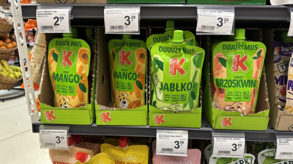
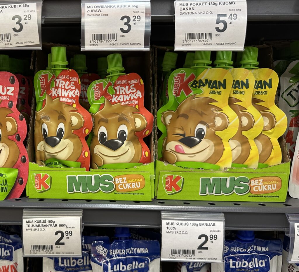
The Good: The Kubuś carton is a benchmark for effective SRP.
The bright green color perfectly aligns with the brand’s “natural/fruit” identity.
The tray lip is used strategically to scream “BEZ DODATKU CUKRU” (No Added Sugar). This is a critical benefit for parents.
The die-cut is clean, and the height of the front wall is perfectly calibrated—it holds the flexible pouches upright so the character’s faces are always visible, yet it doesn’t hide the product name. It utilizes every centimeter of the front-facing “lip” to communicate value.
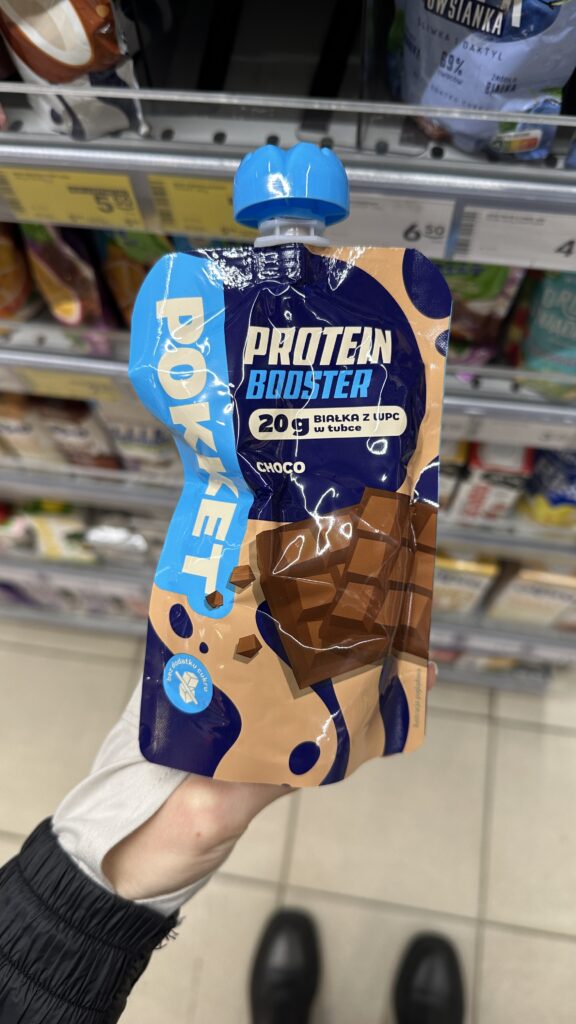
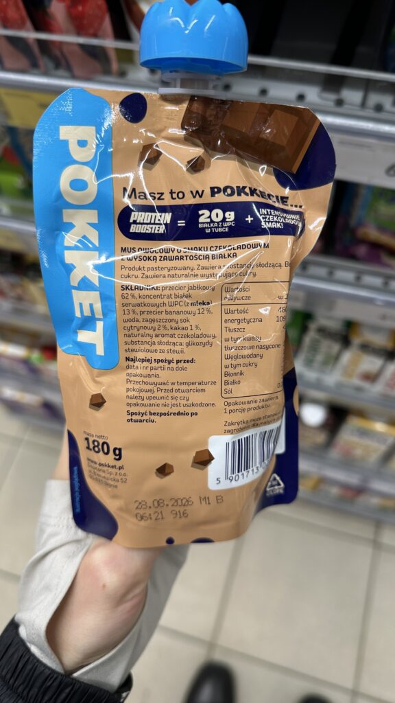
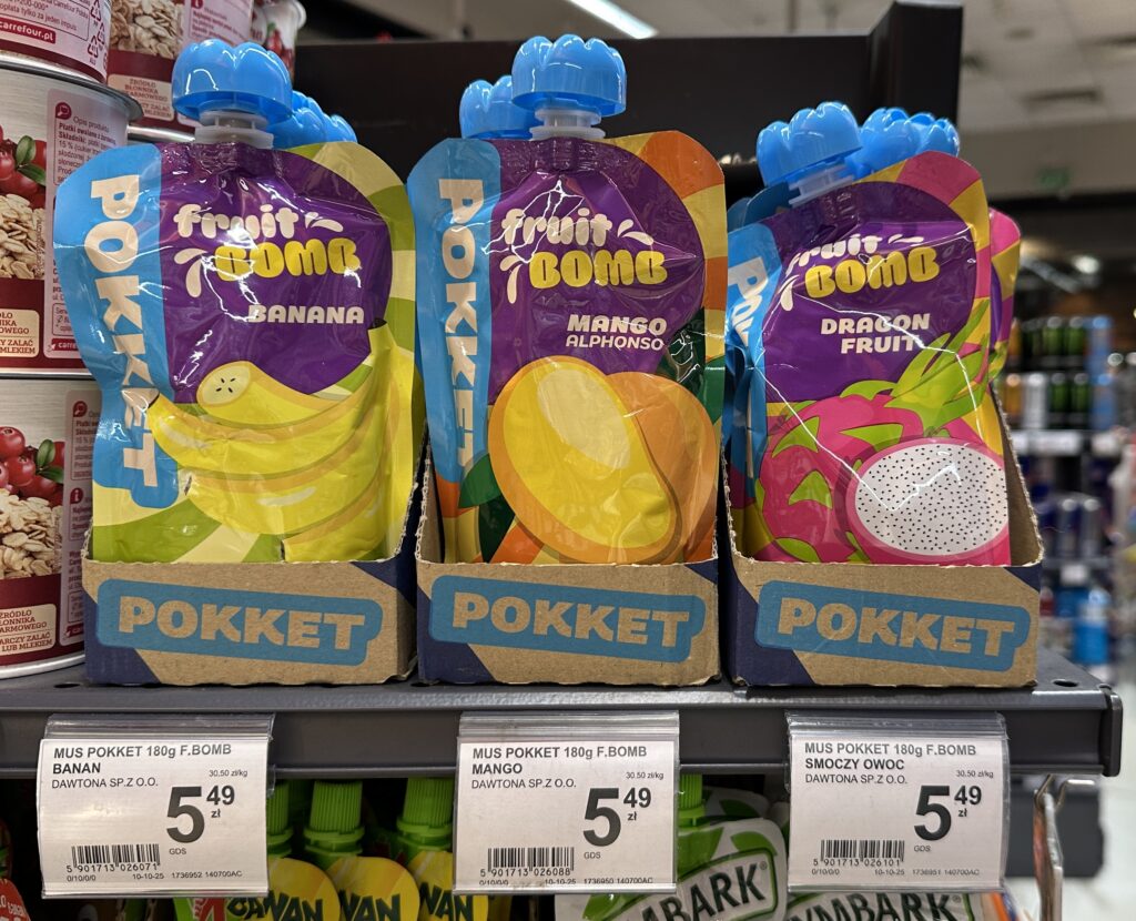
The Bad: Pokett Fruit Bomb While the design of product itself seems to be modern, the execution of the collective carton leaves room for improvement.
The carton doesn’t give any message. The only thing included is the logo of the brand, that’s all.
Carton’s grey/brown color doesn’t make an eye catch; it is extremely boring in comparison to the product in exotic flavours. I would expect here something more “screaming”, maybe even neon color to give the product even more “exotic vibe”.
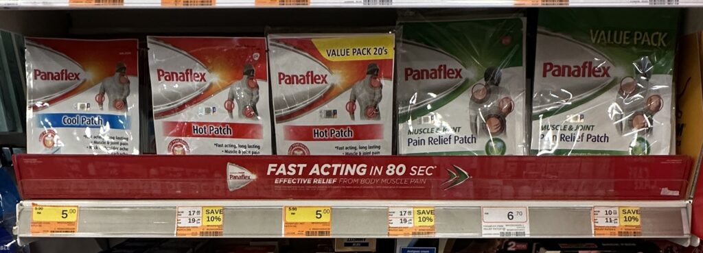
The Good: Panaflex This is a classic example of a “Value Pack” display.
The red“FAST ACTING IN 80 SEC” banner is a brilliant use of the shelf edge. It creates a secondary communication layer that sits below the product.
A lot of bad examples
Redundancy – Repeating the brand name 5 times in 10 centimeters. What’s the point?
Shadowing – High carton walls that turn products into “hidden treasures.”
Dead Space – Leaving huge % of the vertical shelf height empty and unbranded.
Lack of Hierarchy – No clear “hero” message, just a chaotic repetition of logos.
In conclusion, the collective carton is not just a box; it is a multifunctional tool.
To succeed, it must:
protect the goods,
respect the worker,
invite the shopper,
shout the brand’s message.
In the battle for the “First Moment of Truth,” the carton is often the deciding factor in whether a product moves from the shelf to the basket.
I’ve spent +5 years working across Demand Planning, Forecasting, and S&OP roles, and in February 2026 I reviewed what employers consistently expect from entry-level candidates. Below, I’ll walk you through these expectations — and help you understand if Demand Planning is the right path for you.
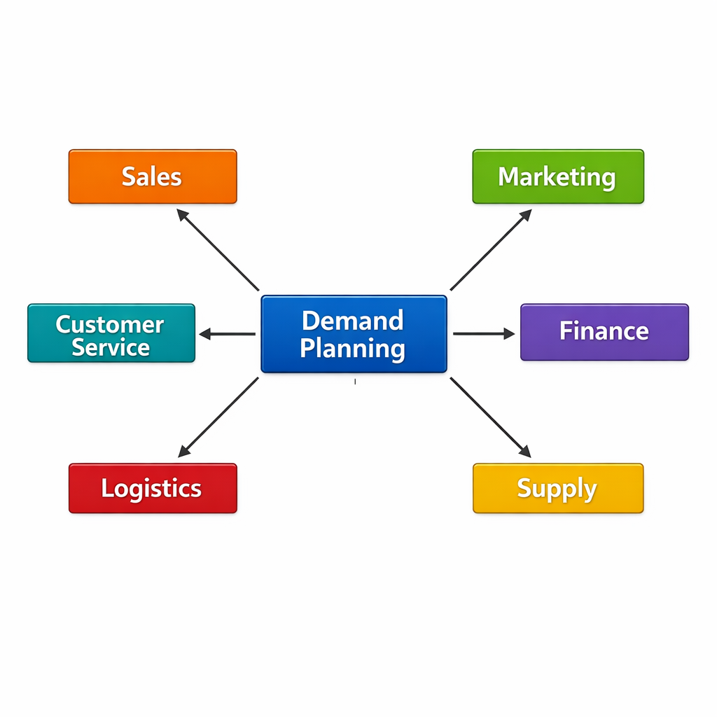
What Demand Planning Actually Is
Demand Planning sits at a unique intersection of the organization. Think of it as the bridge between the commercial side (Sales, Marketing, Finance) and the operational side (Supply Planning, Production, Logistics).
Your role is simple in theory but challenging in practice:
Understand what customers will buy
Communicate that understanding
Translate it into actionable numbers
Demand Planners don’t produce products.
They don’t set prices.
They don’t run campaigns.
But they ensure the entire company is working with a single, realistic view of future demand. If you do your job well, companies avoid stockouts, reduce waste, stabilize production, and make much better decisions.
This is why the role is so cross‑functional — and why people skills matter as much as technical ones.
Thinking if a Job in Demand Planning is a Good Idea for You?
When you should consider Demand Planning:
Enjoy working with data and finding patterns
Like solving problems and asking “why?”
Feel comfortable with ambiguity
Enjoy interacting with different teams
Prefer structured work but still want room for interpretation
Want a job that gives broad business exposure early in your career
It may not be the right fit if you:
Dislike analytical work or numbers
Prefer fully predictable tasks
Avoid discussions or conflict
Have difficulty summarizing information clearly
Don’t want to work with Excel, data tools, or systems
Dislike being accountable for outcomes
The truth is: Demand Planning attracts people who enjoy clarity and logic — but are also comfortable navigating uncertainty. If that balance appeals to you, you’ll likely thrive. I saw people who were “tech nerds” – awesome in data, terrible working with people. It wasn’t good idea for them to continue in DP. I also saw a brilliant communicator who was scared of Excel. It was awesome to talk to that person but horror to work with that person. Demand Planning is more about balance between those two extremes.
Key Requirements for Starting a Career in Demand Planning (2026 Analysis)
Below are the competencies employers consistently list for entry-level roles — and why they matter.
Demand Planning is fundamentally about working with data. You don’t need to be a data scientist, but you must understand:
Trends
Seasonality
Basic forecasting logic
Calculations and data analysis
How to form conclusions from numbers
You’ll spend a big part of your week reconciling different data sources, challenging assumptions, and explaining numerical outcomes. The stronger your analytical thinking, the faster you’ll grow.
2. Excel & Data Visualization
This may feel basic, but Excel remains the backbone of most demand teams — even in global corporations with advanced tools.
To start you need to know:
Pivot tables
VLOOKUP/XLOOKUP
Basic formulas
Conditional formatting
Chart creation
How to structure data properly
It is nice to prove your skills with a certificate or a personal project. If you have no commercial experience build something for yourself – budgeting tool, semi-automated dashboard, shopping price tracker – that’s enough to show that you know how to organize and structure data well.
Data visualization tools like Power BI or Tableau are a plus — not a must — but you should understand the concept of dashboards.
3. KPIs: Understanding, Measuring, and Interpreting
Measuring KPI values is in general easy. Interpreting them is what Demand Planners get hired for.
Expect to work with KPIs such as:
Forecast accuracy
Bias
Service level
Inventory days
Obsolescence
Your value isn’t in reporting numbers but in explaining:
Why the Forecast Accuracy of only one brand goes down
What root cause created the Out Of Stock Event
What action should follow increase in customer orders
This is where logical thinking truly matters.
4. Planning Software
Getting hands-on experience before your first job is nearly impossible — but that’s okay. What you can actually do is:
Learn the names of top tools. For now I would say – SAP IBP, Kinaxis, o9, Blue Yonder
Understand what these systems do – what are most common views, operations, functions
Watch demos, read documentation, or take free micro-courses – there are plenty of on YouTube or other streaming platforms
Knowing the ecosystem shows that you’re proactive and understand modern planning processes. Bonus points for you!
5. Cross‑Functional Collaboration
Demand Planners interact constantly with:
Sales
Marketing
Finance
Supply Planning
Customer service
People will ask you questions, challenge your numbers, and rely on your conclusions. That means you must show:
Friendly, open communication
Ability to explain numbers clearly
Confidence in discussions
Willingness to listen and find alignment
It’s not a “sit quietly and forecast alone” type of job — communication is half the role. You also have to be prepared for:
working under pressure (especially when the DMR is just around the corner and slides are still not ready!),
dealing with people’s emotions (to answer questions like What? I don’t care that leadtime is 4 weeks, I need product NOW)
staying calm (your miss-click can trigger production worth milions of EUR)
6. English (Especially Corporate English)
If you plan to work in a global corporation, strong spoken Englishis non‑negotiable. You will have to talk in English, write and read mails and even work in software that probably will be in English.
OK, maybe we live in area of LLMs where AI can help you write emails, but…
It cannot replace you during a meeting
It cannot negotiate alignment
It cannot represent your viewpoint
It cannot clarify misunderstandings
Focus on:
Business vocabulary
Meeting language
Common terms in planning and supply chain
Abbreviations (SKU, S&OP, MOQ, etc.)
The more confident you are, the easier the job becomes.
7. Degree
Most companies still require a degree, usually in areas like:
Business
Economics
Engineering
Mathematics
Supply Chain
However, from my experience, your skills matter more than your diploma. A motivated candidate with strong Excel skills and analytical potential often stands out more than someone with a “perfect” degree but no initiative.
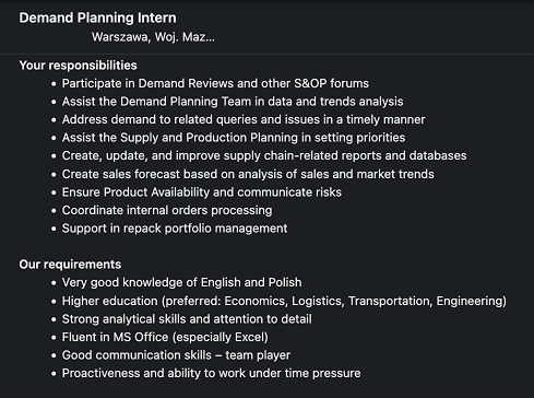
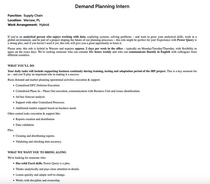
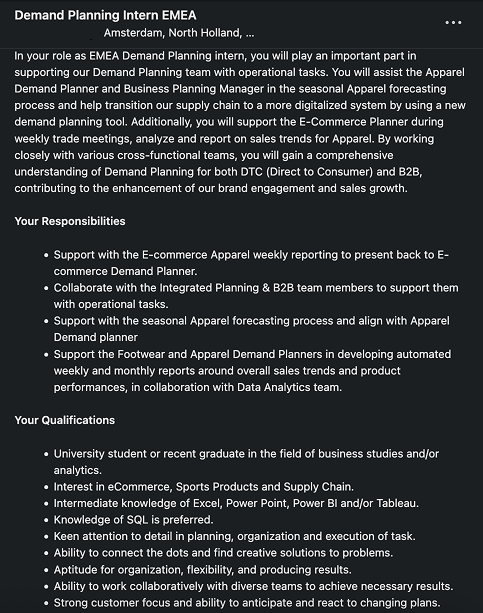
Some examples of entry-level job offers:
Final Thoughts
Demand Planning is an excellent career entry point if you want a strong understanding of how large companies operate. You’ll work with data, processes, people, and systems — all at once. It gives you visibility, responsibility, and a wide set of transferable skills.
But it also requires curiosity, discipline, communication skills, and a willingness to challenge the status quo.
If those qualities resonate with you, then Demand Planning might be the career door that changes everything.
Walking the aisles today, I spotted a perfect example: basicflour transformed into a “crafted” essential for culinary enthusiasts.
If you’re a foodie aiming for that perfect Neapolitan pizza or a delicate sponge cake, you don’t want just flour; you want a premium ingredient that respects your craft.
Battle: Standard Flour vs Premium Flour
Let’s look at the hard-comparison:
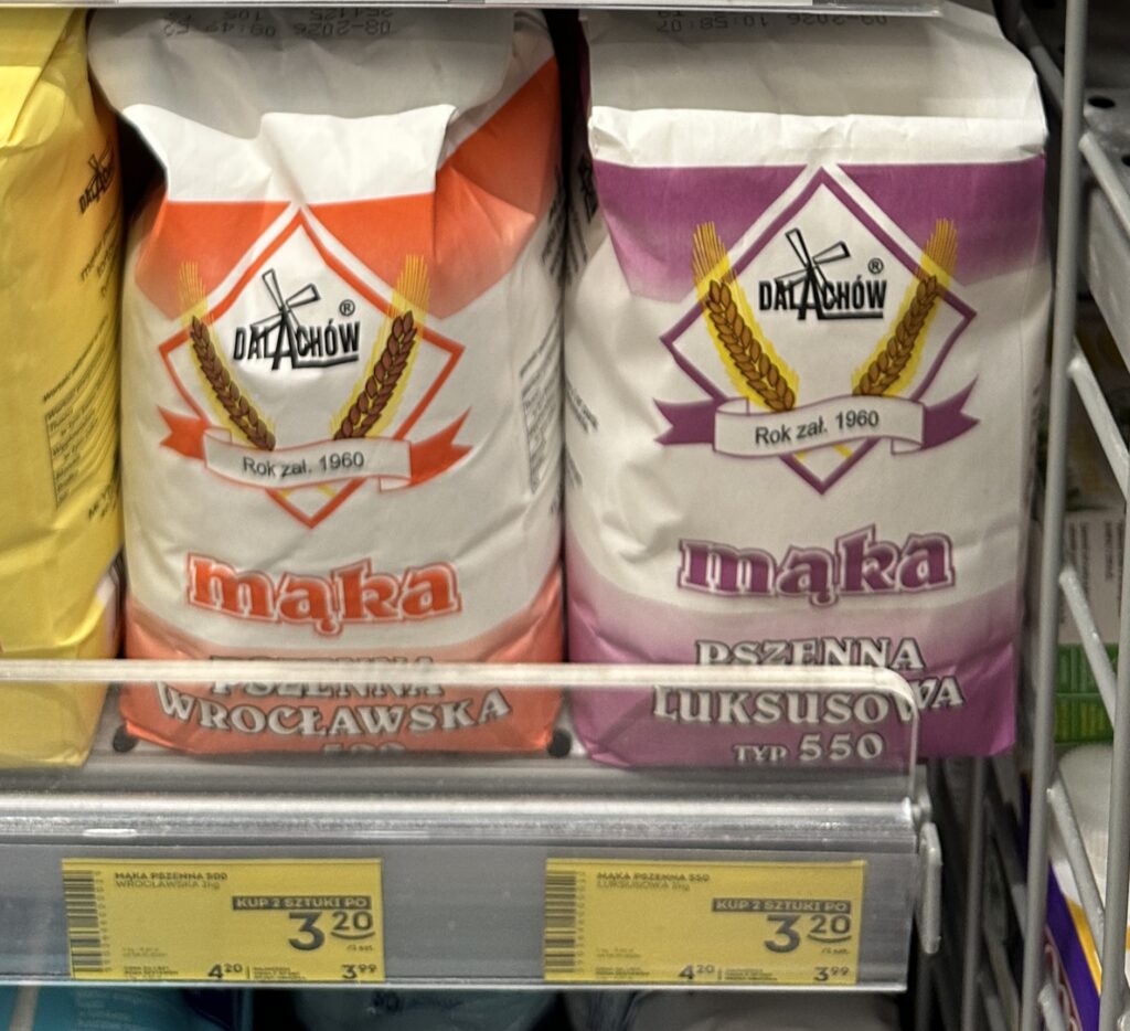
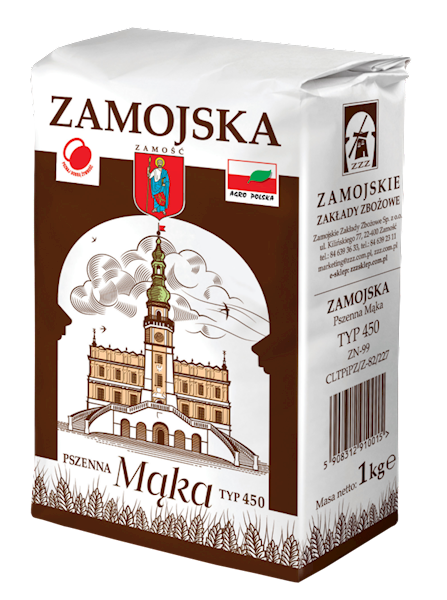
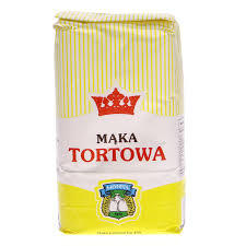
STANDARD (Młyn Dalachów)
Weight: 1kg
Price: 3.20 PLN
Price per KG: 3.20 PLN PLN/kg
Packaging Format: paper bag
Convenience: Low – Requires storage container after opening
Brand Identity: Heritage, Reliable, Commodity
Shelf Impact: Low (Blends with category standard)
Target Audience: Price-conscious families, traditional cooks
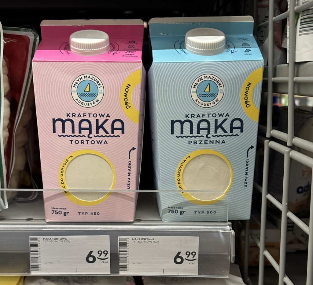
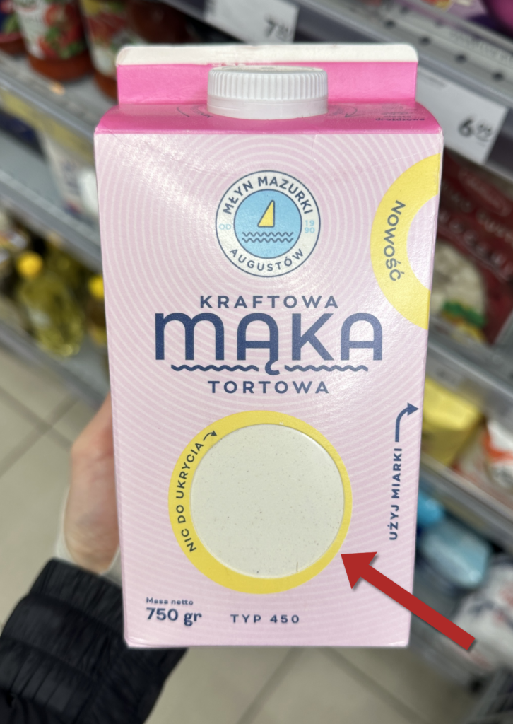
PREMIUM (Młyn Mazurki)
Weight: 0.75kg
Price: 6.99 PLN
Price per KG: 9.32 PLN/kg
Packaging Format: paper bag
Convenience: High – Easy to store, easy pour
Brand Identity: Modern, Premium
Shelf Impact: High (Unique shape/color)
Target Audience: Urban “foodies,” hobbyist bakers
How do you turn an “unsexy” commodity into a foodie’s holy grail?
It’s all about solving the “pain points” of the traditional shopping and cooking act. Let’s look deeper.
Visual Identity | While most competitors cling to 19th-century nostalgic illustrations, Młyn Mazurki went bold and modern. The pastel palette and clean typography appeal directly to Millennials and Gen Z.
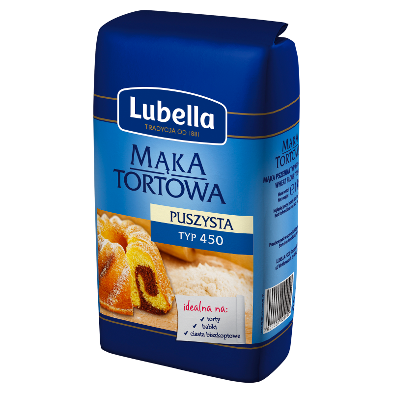
Typical Designs of Flour Product:
The “Trust Window“| By including a transparent circular window on the front, they eliminate the “mystery” of the content. You see the texture and puritybefore you buy. In a category prone to moisture or pest issues, this is a massive trust-builder.
Tetra Pack – multiple benefits:
Precision Pouring – The plastic cap allows for controlled dosing. No more “flour clouds” or accidental spills.
The Integrated Scale – The side of the pack features a transparent strip with a weight scale. It’s a genius move for the “weight-scale-less” kitchen.
Container itself – It eliminates the need for the consumer to transfer the product into a separate glass jar.
Climate Shield – Unlike paper, this packaging offers a barrier against UV light and humidity, ensuring the flour remains its quality.
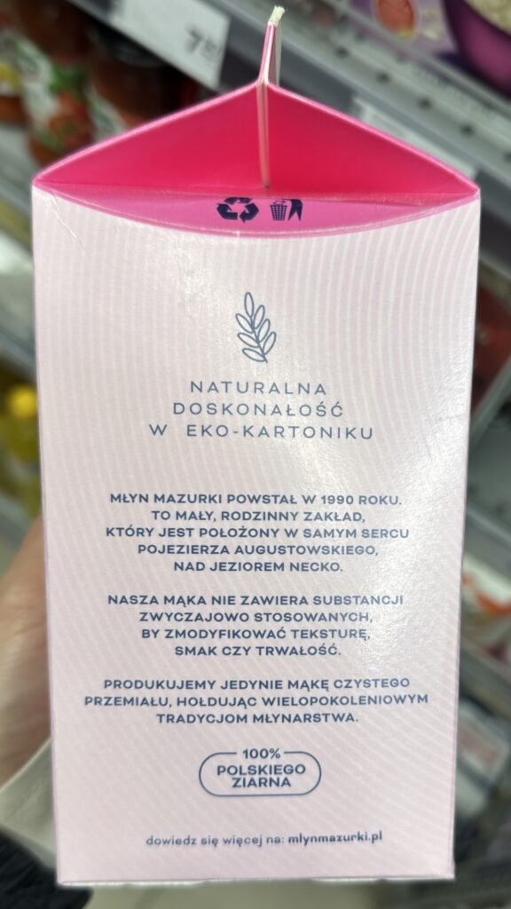
The “Emotional” Premium | The side panel isn’t just text; it’s a manifesto.
Producer highlights their location in the heart of the unpolluted Lake District, near Lake. In FMCG, “origin” equals “quality.”
Company states the absence of artificial substances used to modify texture or taste. Another extra points to prove the quality.
By usage of eco-carton producer align with the growing consumer demand for responsible packaging, even in the baking aisle.
Others:
Lighter than standard 1kg – At 750g, it’s lighter and more ergonomic for the “occasional baker” or the urban shopper on foot.
Clean shopping experience -Traditional paper flour bags often leak, leaving a white trail in the shopper’s bag. This carton is “clean-bag” guaranteed, improving the post-purchase experience.
Control BBD – Very easy to control Best Before Date after buying the product as it is printed on the top and visible.
Price advantage – format of 750g allows for a more competitive price point compared to a full 1kg premium bag, while maintaining a higher margin per gram (with same margin 1kg product would be 9.32 PLN/kg so in customer rounding this is like 10 PLN)
Now – Reality Check – Innovation or Illusion?
While the “Młyn Mazurki” execution is a masterclass in consumer psychology, we must look beneath the pastel surface to see the strategic trade-offs being made.
The Greenwashing Trap & The “Eco” Paradox
The packaging proudly claims to be an “eco,” but from a circular economy perspective, this is a classic case of greenwashing. While a traditional paper flour bag is 100% compostable and easily recycled in a single stream, a Tetra Top® is a complex multi-layer composite of paperboard, plastic, and sometimes aluminum.
It is one of the most difficult materials to process in standard recycling facilities.
By moving from paper to plastic-capped cartons, the brand has actually increased the environmental footprint of the product while marketing it as “natural perfection.”
The “AI Design” Margin Maximizer
We are entering an era where “premium” aesthetics have a lower barrier to entry than ever before. With the high availability of AI-driven graphic design tools, creating a “modern, minimalist, Gen-Z-friendly” look costs almost nothing in terms of creative overhead. The real innovation here isn’t the art—it’s the format change. By dropping the weight to 750g and wrapping it in a “high-tech” carton, the producer successfully masks a significant price-per-kilo hike. It’s a brilliant enabler to maximize profit margins under the guise of “craft” quality.
The Future of Convenience: The “Middle Ground” Strategy
This product signals a fascinating shift for convenience stores (Zabka, 7Eleven, etc.). Should these stores focus on “Ready-to-Eat” (RTE) or “Ready-to-Cook” (RTC) premium ingredients?
The Compromise – This flour represents a middle ground. It’s for the foodie who finds restaurant prices too high but refuses to settle for the low quality of a microwaveable meal.
Convenience stores are becoming “culinary hubs” for the quality-conscious shopper. Offering premium ingredients in “small-batch” formats (like 750g) allows consumers to create a “better-than-restaurant” meal at home without the waste of bulk buying.
Final Thought
Młyn Mazurki has successfully gamified the baking act. They’ve turned a messy chore into a precise, aesthetic experience. It’s a win for the profit margin and the user experience, even if the planet takes a back seat in the process…
Would you believe that a single supermarket shelf in Poland tells the story of a massive social shift? To the uninitiated, it’s just a mix of dessert options. To an FMCG analyst, it is a roadmap of how we live, age, and eat.
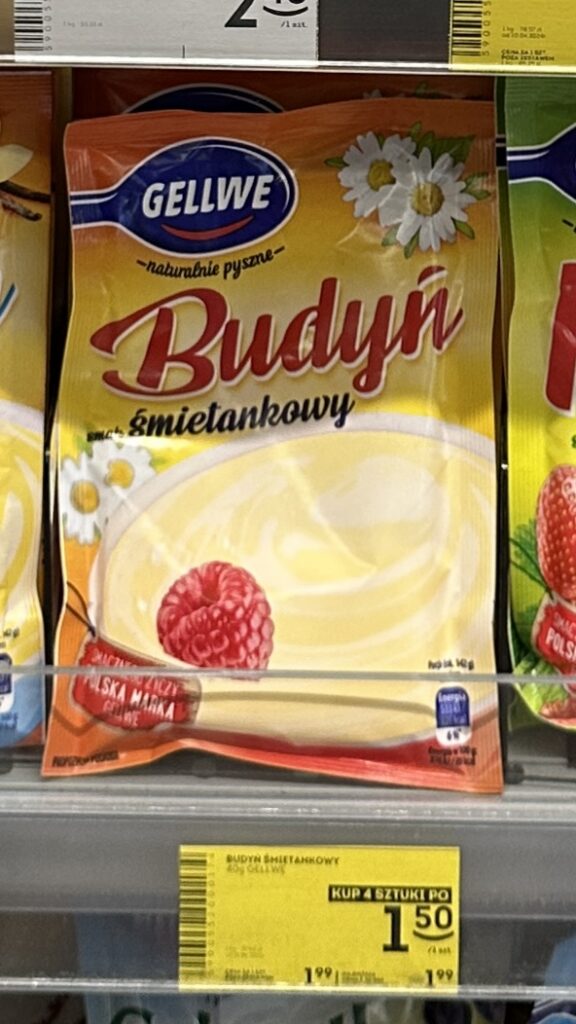
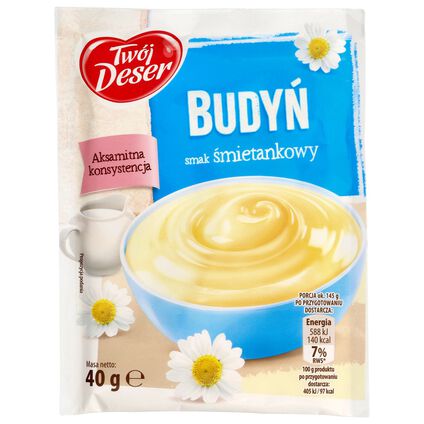
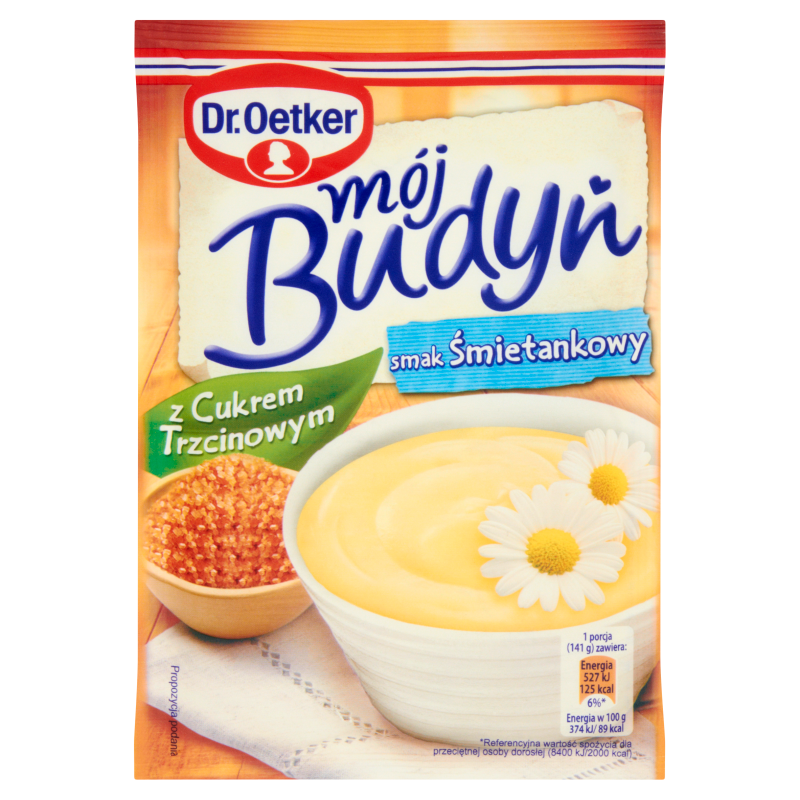
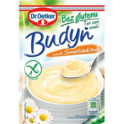
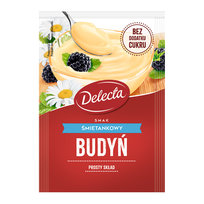
“Budyń” is the Polish equivalent of English Pudding . Traditionally a warm, milk-based dessert thickened with starch, it has long been the “comfort food” of the nation. But the way we consume it is changing, reflecting a shift from the communal family table to the “on-the-go” individual.
The Three Eras
Let’s go deeper and see what was the shift that happened here.
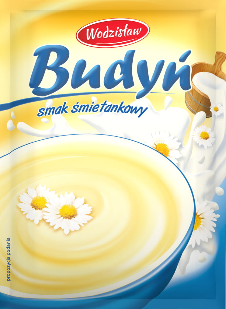
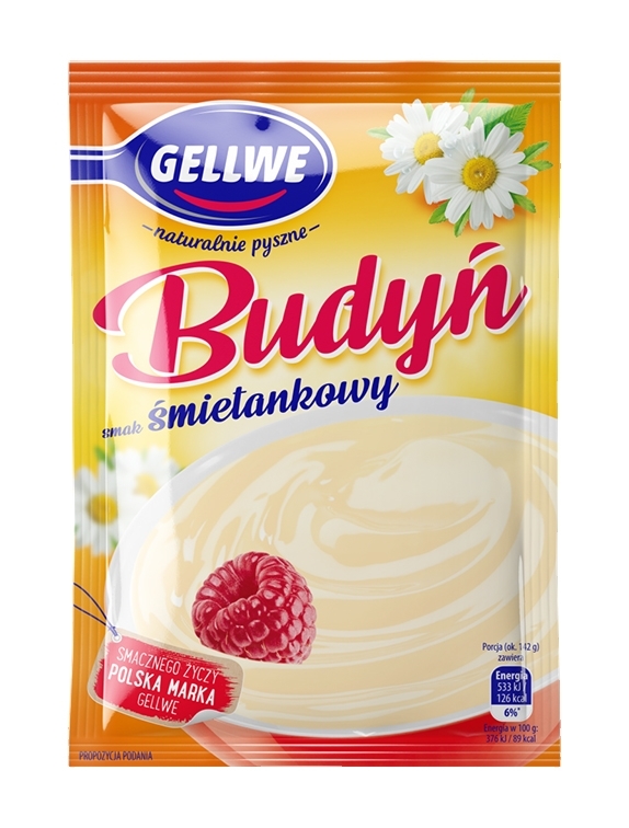
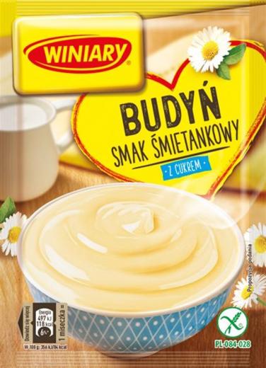
The Traditional Ritual (The Family Pack)
You buy a 40g sachet of powder, milk, and sugar. In the kitchen, you whisk, boil, and stir. One packet yields four portions. This is the essence of old-fashion family model —a communal experience where the dessert is shared, and the labor of cleaning the pot is a small price for a family moment.
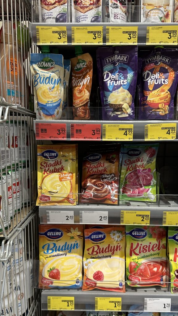
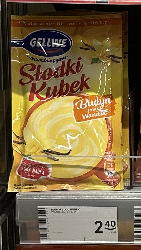
The Semi-Modern Shift (The “Cup” Revolution)
Enter the “Słodki Kubek” (Sweet Cup). You buy a smaller sachet, add boiling water and stir it directly in a coffee mug. It’s a single portion. No leftover waste, no separate pot to scrub. This was our first hint that the Polish household was shrinking.
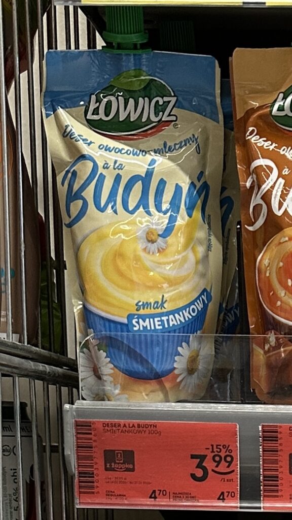
The Hyper-Modern Reality (The Tube)
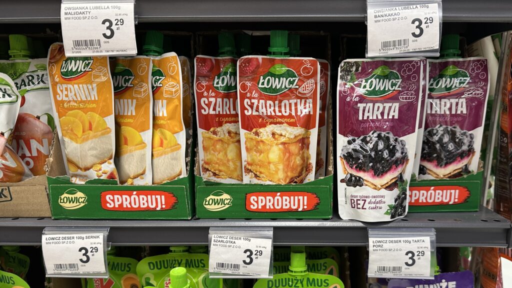
The latest evolution is the ready-to-eat pudding in a squeeze tube, like the Łowicz “à la Budyń” pictured. No kitchen, no extra ingredients, no skills, and zero cleanup. It is the ultimate “frictionless” food. You eat it on the way to the office or as a quick evening snack, and then the packaging vanishes into the bin. It’s a dessert for a life that doesn’t stop for a boiling pot.
The Demographic Engine – Why This Makes Sense
This shift isn’t just about laziness; it’s about the math of modern living. According to Eurostat, the average household size in Poland has been steadily dropping, now sitting at approximately 2.6 members, with one-person households becoming the fastest-growing segment in urban areas [Source: Eurostat, 2023]. We no longer need four portions because, increasingly, there is only one person at the table.
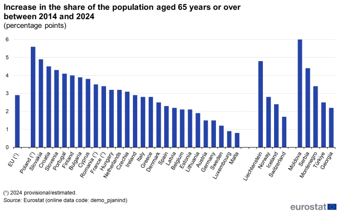
Another factor – The Silver Economy. Poland is one of the fastest-aging societies in the EU. By 2050, it is estimated that people aged 65 and over will make up over 30% of the population [Source: GUS].
For the elderly, the “pudding tube” is a stroke of genius. As manual abilities decreases, the struggle of holding a spoon or the danger of handling boiling milk on a stove becomes a barrier. A squeeze tube removes the risk of broken glass and the physical toll of cleaning, allowing seniors to enjoy theflavors of childhood safely and independently.
The “Daisy” Mystery
BTW – Have you noticed that almost every Cream flavored pudding features a daisy on the packaging?
What’s the business behind?
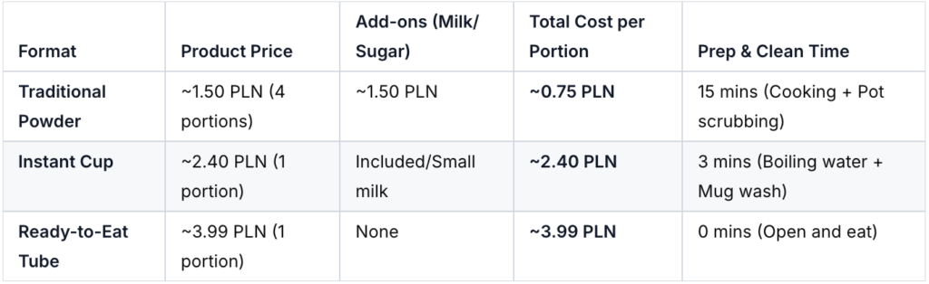
How much does that free time actually cost you? Let’s look at the financial breakdown of one portion of vanilla/cream pudding across the three formats.
Moving from the traditional pot to the modern tube increases your cost per serving by over 430%. However, in a world where a “household” is often just one busy professional or one elderly person with limited energy, the market has decided that 15 minutes of your life is worth more than the 3.24 PLN price gap.
What’s the conclusion here?
We aren’t just buying pudding anymore; we are buying the right to not have a kitchen.
We are buying the proof that in the modern world, the craving for tradition no longer requires the presence of a home.
We are buying a mess-free existence, with no more “dirty pot” era.
By choosing the squeeze tube, we trade a few extra zlotys for a dessert that requires no spoon, no bowl, and no cleanup—just pure, instant nostalgia that fits in a pocket.
I recently found somewhere on the internet this quote:
“Forecasting is the art of saying what will happen, and then explaining why it didn’t.”
A forecast, by its very nature, will never be perfect. It can be statistically sound, highly disciplined, and remarkably accurate, but it will never achieve 100% certainty.
The world is simply too volatile.
From localized supply disruptions and material shortages to “Black Swan” events like pandemics, geopolitical shifts, or sudden regulatory changes, there is always an unpredictable variable waiting to disrupt our models. Even something as simple as an unseasonable temperature spike or a late delivery can impact a finely-tuned plan.
Since we cannot eliminate error, our value as professionals lies in how we manage it.
To move from reactive firefighting to proactive planning, we must follow a three-step evolution:
Let go of “perfection trap” and accept that variance is an inherent part of the business.
Detect and measure as crazy – We cannot manage what we do not measure. We must implement high quality KPIs to identify where and when our predictions diverged from reality.
Turn Data into Root Cause Analysis – Measuring the error is only half the battle. The real “art” is understanding the why behind the delta, allowing us to prepare better for the future.
So, if you are already over the point No. 1 (seriously, accept that your forecast will never be perfect, otherwise change your profession), let’s focus on the analytical part: detecting and measuring forecasting errors.
Here are the most popular KPIs for measuring forecast errors in demand planning, supply chain, and business forecasting:
Forecast BIAS
MAD
MAPE
RMSE
I’ll explain each one in simple, straightforward way to make you feel confident in this field.
1. Forecast Bias
The difference between the actual value and the forecasted value.
What it tells you in easy words: It shows whether your forecasts are too high (over-forecasting) or too low (under-forecasting).
Positive bias = tending to overestimate
Negative bias = tending to underestimate
Advantages
Very easy to interpret: immediately tells you the direction of the problem (are we consistently too optimistic or too pessimistic?)
Critical for business decisions — e.g., chronic over-forecasting creates excess inventory, chronic under-forecasting causes stockouts and lost sales
Disadvantages
Positive and negative errors cancel each other out → you can have a near-zero bias even with large errors in both directions (very misleading if used alone).
Doesn’t tell you anything about the size or magnitude of the errors.
2. MAD / MAE (Mean Absolute Deviation / Mean Absolute Error)
The absolute value of the error (ignoring whether it’s positive or negative).
It’s the average size of your errors, ignoring whether they were over- or under-. If MAD = 120 units, your forecasts are wrong by 120 units on average (in absolute terms).
Advantages
No cancellation of positive/negative errors → gives a honest picture of typical error size.
Super intuitive and expressed in the same units as your data (e.g., pieces, kg) → easy to explain to managers and planners.
Treats every error equally (no extra punishment for big ones) → robust when you have occasional outliers or “crazy” values.
Disadvantages
Doesn’t penalize large errors more than small ones → if big misses hurt your business much more (e.g., stockouts of high-value items), it underplays their importance.
Not scaled → hard to compare accuracy across products with very different volumes (50-unit error on a 100-unit item is worse than on a 10,000-unit item).
3. MAPE (Mean Absolute Percentage Error)
The average of absolute percentage errors across all data points.
It shows the average error as a percentage of the actual value. If MAPE = 12%, your forecasts are off by 12% on average (in relative terms).
Advantages
Scale-independent → great for comparing accuracy across products, categories, or time periods with very different volumes (e.g., comparing a slow-moving spare part to a fast-moving SKU).
Very intuitive for non-technical people → “we’re wrong by about 15% on average” is easy to understand and communicate.
Widely used and expected in business reporting.
Disadvantages
Becomes extremely large or even undefined when actual values are zero or very close to zero (division by zero or tiny numbers blows up the percentage, sometimes worth to exclude such cases).
Asymmetric: over-forecasting a small number hurts MAPE much more than under-forecasting → can bias models toward lower forecasts when optimized on MAPE.
4. RMSE (Root Mean Square Error)
The square root of the MSE (Mean Squared Error), giving a measure of the average magnitude of the forecast errors.
It’s like MAD but gives much more weight to your largest errors (because errors are squared before averaging, then square-rooted back). It still ends up in the same units as your data.
Advantages
Strongly penalizes big errors → perfect when large misses are especially costly (e.g., under-forecasting peak demand)
Same units as the original data → reasonably interpretable.
Disadvantages
Very sensitive to outliers → one or two huge errors can make RMSE look dramatically worse, even if most forecasts are good.
Harder to explain to non-technical stakeholders than MAD or MAPE (“what does an RMSE of 450 really mean?”).
Below you can find quick Recommendation Table (when to prefer each)
Metric
Best when you want to…
Avoid when…
Business-friendliness
Bias
Detect systematic over/under-forecasting
You only care about error magnitude
★★★★★
MAD/MAE
Robust average error size, no outlier drama
Large errors hurt much more than small ones
★★★★☆
MAPE
Compare across very different scales/volumes
Many zeros or very small actuals
★★★★★
RMSE
Heavily penalize big, expensive mistakes
You have outliers that aren’t meaningful
★★★☆☆
In practice, most mature forecasting teams look at several of these together — especially Bias + one absolute measure (MAD or MAPE) + RMSE when big errors matter a lot.
Summary
I hope this short comparison of KPIs makes it easier for you to select exactly the ones you need! Remember, the audience to whom you want to show the data is key, so select your KPIs wisely!
Soon, I will prepare the next post for you, in which I will dive deep into Step No. 3: how to use those calculations to generate real insights. Stay tuned!